You collected survey responses for your thesis. Now you are staring at a spreadsheet full of numbers and wondering what to do next. This is exactly where most students get stuck.
The good news is that Excel has everything you need to analyze questionnaire data properly. You do not need expensive software like SPSS. With the right approach, you can calculate reliability, run descriptive statistics, test hypotheses, and format results for your thesis using tools you already have.
This guide walks you through the complete survey analysis process in Excel. You will learn how to prepare your data, check reliability with Cronbach's Alpha, calculate descriptive statistics, choose the right statistical test, and write results in APA format. By the end, you will have a clear workflow that takes you from raw survey responses to thesis-ready findings.
What you will learn:
- How to organize and clean survey data before analysis
- Calculate Cronbach's Alpha to check scale reliability
- Compute descriptive statistics for Likert scale responses
- Choose and run the appropriate hypothesis test
- Create frequency tables and cross-tabulations
- Write statistical results in proper APA format
To follow along with this tutorial, download the Survey Analysis Excel Template from the sidebar's Downloads section.
What Is Survey Data Analysis?
Survey data analysis is the process of transforming raw questionnaire responses into meaningful insights that answer your research questions. For thesis students, this typically involves calculating reliability coefficients, summarizing response patterns, and testing hypotheses about relationships between variables.
Most academic surveys use Likert scales where respondents rate their agreement with statements from 1 (Strongly Disagree) to 5 (Strongly Agree). These responses need specific handling because they represent ordinal data that researchers commonly treat as interval data for statistical purposes.
Your analysis approach depends on your research objectives:
| Research Goal | Analysis Method |
|---|---|
| Describe response patterns | Frequencies, means, standard deviations |
| Check questionnaire quality | Cronbach's Alpha reliability |
| Compare two groups | Independent samples t-test |
| Compare multiple groups | One-way ANOVA |
| Examine relationships | Pearson correlation |
| Predict outcomes | Regression analysis |
Table 1: Common research goals and their corresponding statistical analysis methods
Before diving into calculations, you need properly structured data. The next section covers how to prepare your survey responses for analysis.
Preparing Your Survey Data for Analysis
Raw survey data rarely comes ready for analysis. Students often make errors at this stage that cause problems later. Taking time to properly organize and clean your data prevents headaches down the road.
Organizing Your Data Structure
Your Excel spreadsheet should follow a simple structure: each row represents one respondent, and each column represents one survey item or variable. The first row contains column headers with clear, short names.
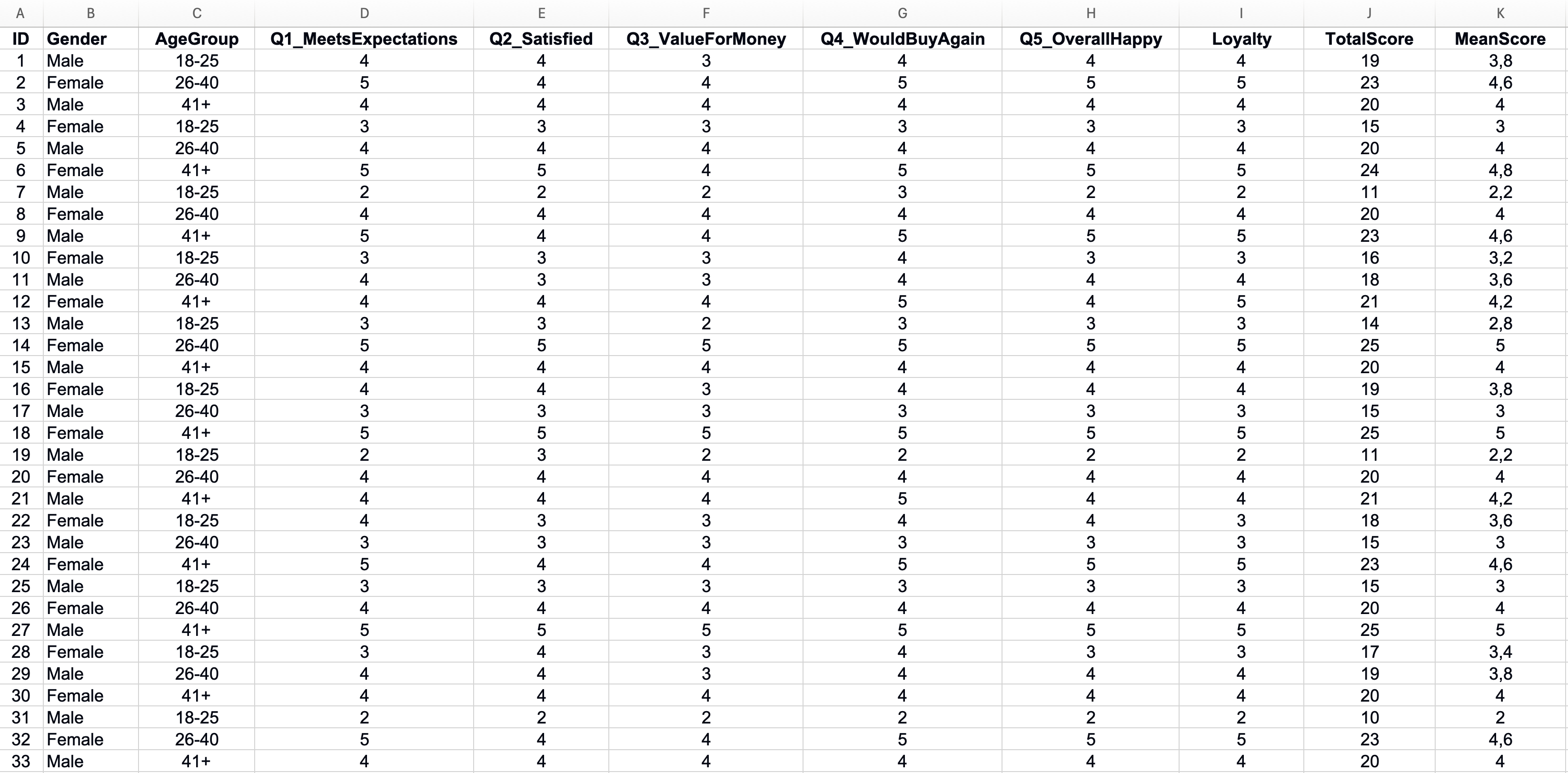 Figure 1: Properly organized Excel survey data structure
A few rules keep your data analysis-ready:
- Use numeric codes for responses (1-5 for Likert scales, 1 for Yes and 0 for No)
- Keep one variable per column
- Do not merge cells or add blank rows between data
- Use consistent coding throughout (do not mix 1-5 and 0-4 scales)
Note for Excel users outside the US: Excel formula separators depend on your regional settings. If your system uses commas as decimal separators (e.g., 3,14 instead of 3.14), you'll need to use semicolons instead of commas in formulas. For example, use
=COUNTIF(B2:B101;1)instead of=COUNTIF(B2:B101,1). All formulas in this guide use the US format (commas). Adjust accordingly for your locale.
Coding Categorical Variables
Survey responses often include categorical data like gender, education level, or department. Convert these text responses to numeric codes before analysis.
| Original Response | Numeric Code |
|---|---|
| Male | 1 |
| Female | 2 |
| Prefer not to say | 3 |
Table 2: Example of categorical variable coding for gender responses
Create a separate coding sheet in your Excel workbook that documents what each number means. This reference becomes essential when interpreting results and writing your methodology section.
Handling Reverse-Scored Items
Some questionnaires include negatively worded items to catch inattentive respondents. Before calculating scale scores, you must reverse-code these items so all responses point in the same direction.
For a 5-point Likert scale, the formula to reverse scores is:
In Excel, if your maximum scale value is 5 and the original response is in cell B2:
=6-B2A response of 1 becomes 5, a response of 2 becomes 4, and so on. Create a new column for the reversed item rather than overwriting the original data.
Identifying Missing Data
Missing responses create problems for statistical analysis. Before proceeding, identify where gaps exist in your dataset.
Use Excel's COUNTBLANK function to count empty cells in each column:
=COUNTBLANK(B2:B101)This tells you how many respondents skipped each question. A few missing values are normal. If one question has many more missing responses than others, investigate why. The question may be confusing or sensitive.
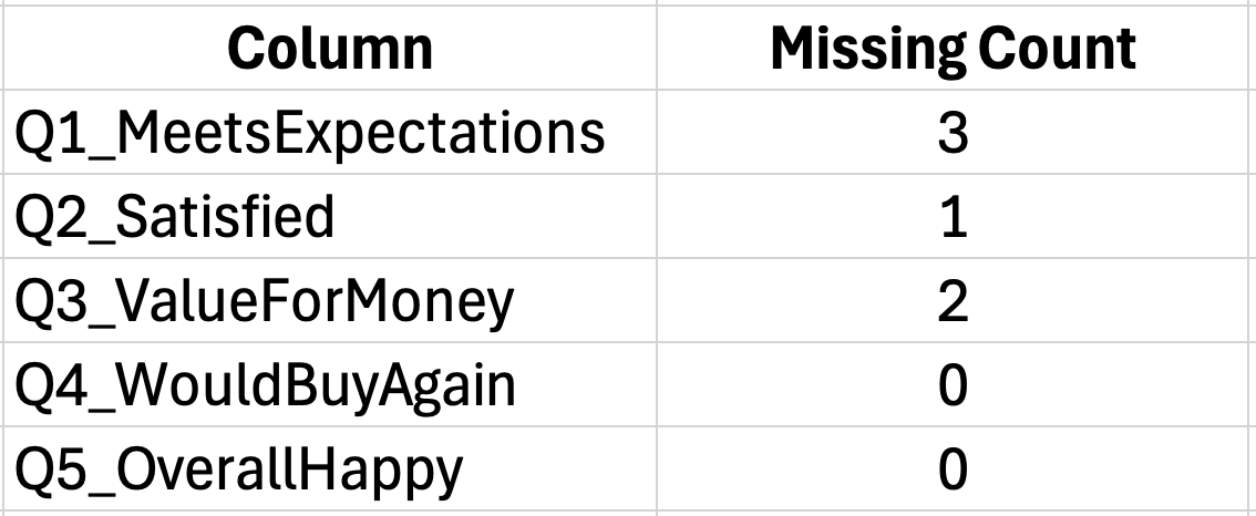 Figure 2: Identifying missing data with COUNTBLANK function
For small amounts of missing data, you have options:
- Delete cases with missing values (listwise deletion)
- Replace missing values with the item mean (mean imputation)
- Leave as-is and let Excel ignore blanks in calculations
Most thesis committees accept listwise deletion when less than 5% of responses are missing. Document your approach in the methodology section. For a comprehensive guide to handling missing data with step-by-step Excel methods, see: How to Handle Missing Data in Excel Survey Analysis
Calculating Total and Subscale Scores
Survey instruments often contain multiple subscales that measure different constructs. Before analysis, calculate the total score for each subscale by summing (or averaging) the relevant items.
For a 5-item scale measuring "Customer Satisfaction":
=SUM(B2:F2)This calculates the total score for Respondent 1 across items in columns B through F. Copy this formula down for all respondents.
Using AVERAGE instead of SUM keeps scores on the original 1-5 metric, which makes interpretation easier:
=AVERAGE(B2:F2)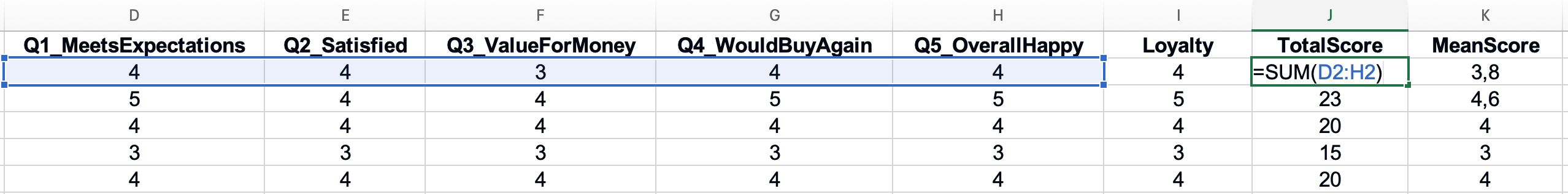 Figure 3: Calculating total and mean scores for subscales
With your data properly prepared, you can now check whether your scale reliably measures what it claims to measure.
Calculate Your Sample Size
Use our free calculator to determine your required sample size using Yamane, Cochran, and Krejcie & Morgan. Compare all three methods and get an APA-ready citation for your thesis.
Try CalculatorChecking Reliability: Cronbach's Alpha in Excel
Before analyzing your survey results, you need to verify that your questionnaire actually works. Cronbach's Alpha tells you whether the items in your scale measure the same underlying construct consistently. A scale with low reliability produces results you cannot trust.
Think of it this way: if you measured the same person twice with a reliable scale, you would get similar scores. An unreliable scale gives different results each time, making it impossible to draw valid conclusions.
When to Calculate Cronbach's Alpha
Calculate reliability for any multi-item scale in your questionnaire. If you used an established instrument like the Job Satisfaction Scale or Customer Loyalty Index, previous researchers have already established reliability. However, you should still calculate Alpha for your sample to confirm the scale works in your context.
You need Cronbach's Alpha when:
- Your questionnaire contains multiple items measuring one construct
- You plan to sum or average items into a scale score
- You want to establish that your instrument is trustworthy
You do not need it for:
- Single-item measures (one question per construct)
- Demographic questions
- Factual questions with objective answers
The Cronbach's Alpha Formula
Cronbach's Alpha ranges from 0 to 1. Higher values indicate stronger internal consistency among your scale items. The formula is:
Where:
- K equals number of items in the scale
- σ²ᵢ equals variance of each individual item
- σ²ₜ equals variance of the total scale score
This looks complicated, but Excel makes the calculation straightforward.
Step-by-Step Calculation in Excel
Let us work through an example with a 5-item Customer Satisfaction scale using responses from 30 participants.
Step 1: Calculate the variance for each item
Use the VAR.S function for sample variance. If your first item responses are in column B (rows 2-31):
=VAR.S(B2:B31)Repeat this for each item column. Place these variance calculations in a summary area below your data.
 Figure 4: Calculating individual item variances
Step 2: Sum the item variances
Add together all individual item variances:
=SUM(G35:G39)If your item variances are in cells G35 through G39, this gives you the sum of item variances.
Step 3: Calculate the total score variance
First, calculate each respondent's total score by summing across items:
=SUM(B2:F2)Then calculate the variance of these total scores:
=VAR.S(G2:G31)Step 4: Apply the Cronbach's Alpha formula
With K=5 items, item variance sum in cell G40, and total variance in cell G42:
=(5/4)*(1-(G40/G42))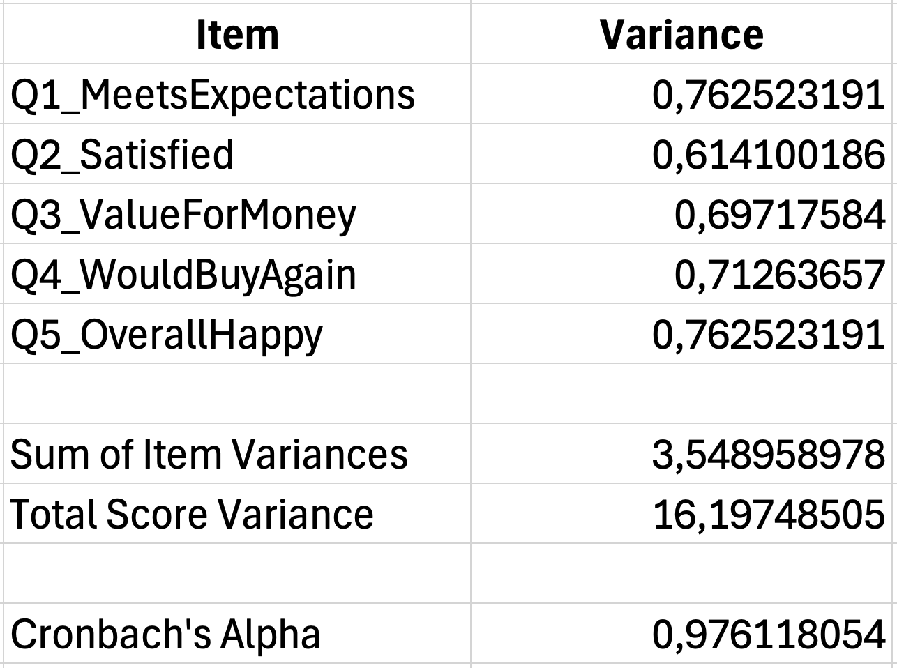 Figure 5: Complete Cronbach's Alpha calculation (α = 0.78)
Interpreting Alpha Values
Once you have your coefficient, use this table to interpret the result:
| Alpha Value | Interpretation |
|---|---|
| 0.90 and above | Excellent |
| 0.80 to 0.89 | Good |
| 0.70 to 0.79 | Acceptable |
| 0.60 to 0.69 | Questionable |
| 0.50 to 0.59 | Poor |
| Below 0.50 | Unacceptable |
Table 3: Cronbach's Alpha interpretation guidelines for reliability assessment
For thesis research, most supervisors expect Alpha values of 0.70 or higher. Values between 0.60 and 0.70 may be acceptable for exploratory research or scales with fewer than 10 items (Pallant, 2016).
For a complete guide with real-world examples, troubleshooting steps for low or high Alpha values, and APA reporting templates, see our detailed post on how to interpret Cronbach's Alpha results. When you are ready to write up your results, see How to Report Cronbach's Alpha in APA Format for correct formatting.
If your Alpha falls below acceptable levels, consider:
- Removing items that do not correlate well with others
- Checking for reverse-scored items you forgot to recode
- Examining whether the construct actually has multiple dimensions
Reporting Reliability in Your Thesis
Include reliability results in your methodology or results chapter. The standard format follows APA style:
The Customer Satisfaction scale demonstrated acceptable internal consistency (Cronbach's α equals 0.78, 5 items).
For multiple scales, present reliability in a table:
| Scale | Number of Items | Cronbach's Alpha |
|---|---|---|
| Customer Satisfaction | 5 | 0.78 |
| Purchase Intention | 4 | 0.84 |
| Brand Loyalty | 6 | 0.91 |
Table 4: Example reliability table showing Cronbach's Alpha values for multiple scales
For detailed instructions on calculating Cronbach's Alpha with a downloadable template, see our complete guide: How to Calculate Cronbach's Alpha in Excel
Descriptive Statistics for Survey Data
With reliability confirmed, you can now describe what your data actually shows. Descriptive statistics summarize response patterns and help readers understand your sample before you present inferential tests.
For survey data, you typically report frequencies, central tendency (mean, median, mode), and variability (standard deviation, range). The specific statistics depend on your measurement level and research questions.
Creating Frequency Tables
Frequency tables show how responses distribute across categories. They answer questions like "How many respondents agreed with this statement?" or "What percentage of participants selected each option?"
Use the COUNTIF function to count responses for each category:
=COUNTIF(B2:B101,1)This counts how many respondents selected "1" (Strongly Disagree) in the range B2:B101.
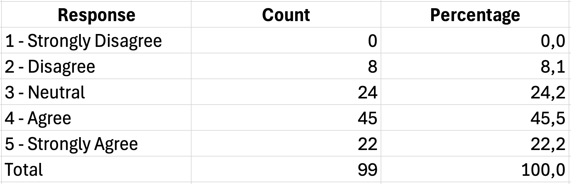 Figure 6: Creating frequency tables with COUNTIF
To calculate percentages, divide each count by the total number of responses:
=D2/SUM($D$2:$D$6)*100The dollar signs lock the total range so you can copy the formula down without it changing.
For a comprehensive tutorial on creating frequency tables including grouped frequencies, cumulative percentages, and cross-tabulations, see: How to Create Frequency Tables in Excel for Survey Data
A complete frequency table for one Likert item looks like this:
| Response | Frequency | Percent |
|---|---|---|
| 1 - Strongly Disagree | 5 | 5.0% |
| 2 - Disagree | 12 | 12.0% |
| 3 - Neutral | 28 | 28.0% |
| 4 - Agree | 35 | 35.0% |
| 5 - Strongly Agree | 20 | 20.0% |
| Total | 100 | 100.0% |
Table 5: Frequency distribution table for a 5-point Likert scale item
Calculating Mean and Standard Deviation
For Likert scale data, researchers commonly report the mean and standard deviation. These statistics summarize the central tendency and spread of responses.
The mean tells you the average response across all participants:
=AVERAGE(B2:B101)The standard deviation indicates how much responses vary from the mean:
=STDEV.S(B2:B101)Use STDEV.S (sample standard deviation) rather than STDEV.P because your respondents represent a sample of a larger population.
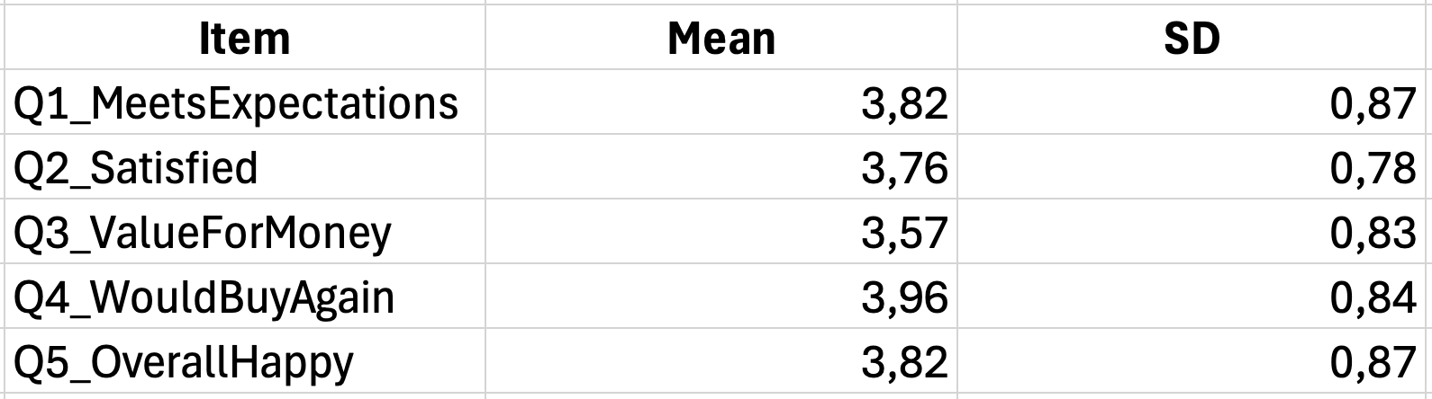 Figure 7: Summary of means and standard deviations
Summarizing Scale Scores
When you have calculated total or average scores for your scales, report descriptive statistics for these composite measures as well.
For a satisfaction scale where you averaged items 1-5:
| Measure | Value |
|---|---|
| Mean | 3.67 |
| Standard Deviation | 0.82 |
| Minimum | 1.40 |
| Maximum | 5.00 |
| Range | 3.60 |
Table 6: Descriptive statistics summary for satisfaction scale composite scores
Calculate these using:
Mean: =AVERAGE(G2:G101)
SD: =STDEV.S(G2:G101)
Min: =MIN(G2:G101)
Max: =MAX(G2:G101)
Range: =MAX(G2:G101)-MIN(G2:G101)
Interpreting Likert Scale Means
A common question is "what does a mean of 3.67 actually mean?" Interpretation depends on your scale anchors.
For a standard 5-point agreement scale:
| Mean Range | Interpretation |
|---|---|
| 1.00 to 1.80 | Strongly Disagree |
| 1.81 to 2.60 | Disagree |
| 2.61 to 3.40 | Neutral |
| 3.41 to 4.20 | Agree |
| 4.21 to 5.00 | Strongly Agree |
Table 7: Interpretation guidelines for mean scores on a 5-point Likert scale
A satisfaction mean of 3.67 falls in the "Agree" range, suggesting respondents generally expressed positive satisfaction levels.
Be careful about over-interpreting small differences. A mean of 3.52 versus 3.48 probably does not represent a meaningful distinction. Look at standard deviations and conduct statistical tests before claiming differences are significant.
Descriptive Statistics by Group
Often you need to compare descriptive statistics across groups, such as males versus females or different age categories. Create separate calculations for each subgroup.
The AVERAGEIF function calculates the mean for specific groups:
=AVERAGEIF(A2:A101,"Male",G2:G101)This calculates the average satisfaction score only for respondents coded as "Male" in column A.
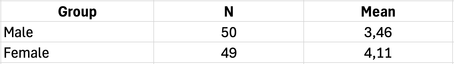 Figure 8: Descriptive statistics by group using AVERAGEIF
For standard deviation by group, you need DSTDEV with a criteria range, or filter your data and calculate separately.
Formatting Descriptive Statistics for Your Thesis
Present descriptive statistics in a clear table format. APA style requires specific formatting:
Table 1 Descriptive Statistics for Customer Satisfaction Scale Items
| Item | M | SD |
|---|---|---|
| The product meets my expectations | 3.82 | 0.98 |
| I am satisfied with my purchase | 3.67 | 1.05 |
| The quality matches the price | 3.54 | 1.12 |
| I would buy this product again | 3.91 | 0.89 |
| Overall, I am happy with the product | 3.78 | 0.94 |
| Scale Total | 3.74 | 0.82 |
Table 8: Descriptive statistics for customer satisfaction scale items
Note. N equals 100. Responses measured on a 5-point Likert scale (1 for Strongly Disagree, 5 for Strongly Agree).
Key formatting points:
- Use M for mean and SD for standard deviation
- Report two decimal places for means and standard deviations
- Include sample size and scale description in the note
- Italicize the table title
For complete APA 7th edition formatting guidelines with copy-paste templates, see: How to Report Descriptive Statistics in APA Format (Excel)
Analyzing Likert Scale Data
Likert scales require special attention because they occupy a gray area between ordinal and interval data. Understanding how to properly analyze these responses prevents common mistakes that can invalidate your findings.
The Ordinal vs. Interval Debate
Technically, Likert responses are ordinal data. The difference between "Agree" and "Strongly Agree" may not equal the difference between "Disagree" and "Neutral." However, researchers routinely treat 5-point and 7-point Likert scales as interval data for practical purposes.
This treatment is generally acceptable when:
- Your scale has at least 5 points
- Response options are evenly spaced (1, 2, 3, 4, 5)
- You analyze composite scale scores rather than single items
When you sum or average multiple Likert items into a scale score, the result more closely approximates interval data and can be analyzed with parametric tests.
Calculating Construct Means
When your questionnaire measures a theoretical construct with multiple items, calculate the mean score across those items for each respondent. This creates a single variable representing the construct.
If items Q1 through Q5 measure "Job Satisfaction":
=AVERAGE(B2:F2)Copy this down for all respondents. The resulting column contains each person's satisfaction score on the original 1-5 metric.
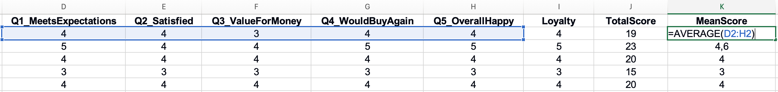 Figure 9: Computing construct mean scores from multiple items
Handling Neutral Responses
The middle point of a Likert scale (typically "Neutral" or "Neither Agree nor Disagree") often receives the most responses. High neutral responses can indicate:
- Respondents genuinely feel ambivalent
- The question is confusing or irrelevant
- Respondents are satisficing (choosing the easy middle option)
Check the frequency of neutral responses for each item. If one question has substantially more neutral responses than others, review the wording.
Creating Grouped Variables
Sometimes you need to collapse Likert responses into fewer categories for analysis or reporting. For example, combining "Agree" and "Strongly Agree" into a single "Agree" category.
Use nested IF functions:
=IF(B2<=2,"Disagree",IF(B2=3,"Neutral","Agree"))This recodes responses 1-2 as "Disagree", 3 as "Neutral", and 4-5 as "Agree".
| Original Scale | Grouped Category |
|---|---|
| 1 - Strongly Disagree | Disagree |
| 2 - Disagree | Disagree |
| 3 - Neutral | Neutral |
| 4 - Agree | Agree |
| 5 - Strongly Agree | Agree |
Table 9: Example of collapsing 5-point Likert scale into 3 grouped categories
Grouped variables work well for presenting results to non-technical audiences. Instead of saying "the mean was 3.67," you can report "55% of respondents agreed or strongly agreed."
Common Mistakes with Likert Data
Several errors frequently appear in thesis work involving Likert scales:
Mistake 1: Analyzing single items with parametric tests
Running a t-test on a single Likert item violates assumptions about interval measurement. Either use non-parametric alternatives (Mann-Whitney U) or analyze composite scale scores.
Mistake 2: Forgetting to reverse-code negative items
If your scale includes negatively worded items, failing to reverse-code them before summing corrupts your scale score. Always check the original questionnaire for reverse-scored items.
Mistake 3: Treating the neutral point as "missing"
Some students exclude neutral responses from analysis, assuming these respondents have no opinion. This creates bias. Neutral is a legitimate response that should be included.
Mistake 4: Over-interpreting decimal differences
A mean of 3.65 is not meaningfully different from 3.58 without a statistical test confirming significance. Report effect sizes alongside p-values to determine practical importance.
For detailed guidance on scale construction and analysis, see our post on How to Calculate Cronbach's Alpha in Excel, which covers item analysis and reliability testing.
Hypothesis Testing in Excel
Descriptive statistics tell you what happened in your sample. Hypothesis testing tells you whether those findings apply to the broader population. Choosing the correct test depends on your research question, the number of groups you are comparing, and the type of data you collected.
Choosing the Right Statistical Test
Use this decision framework to select your test:
Figure 10: Decision flowchart for selecting appropriate statistical tests
| Research Question | Number of Groups | Test to Use |
|---|---|---|
| Is there a difference between two group means? | 2 independent groups | Independent t-test |
| Did scores change from pre-test to post-test? | 2 related measurements | Paired t-test |
| Is there a difference across multiple groups? | 3 or more groups | One-way ANOVA |
| Is there a relationship between two variables? | Not applicable | Pearson correlation |
| Can one variable predict another? | Not applicable | Linear regression |
Table 10: Decision framework for selecting appropriate statistical tests
Before running any test, verify your data meets the required assumptions. Most parametric tests assume normal distribution and homogeneity of variance. For small samples or non-normal data, consider non-parametric alternatives.
For a detailed comparison of when to use each test, including a visual decision flowchart, see our guide: T-Test vs ANOVA in Excel: Which Test Should You Use?
Running a T-Test in Excel
The t-test compares means between two groups. Excel provides this through the Data Analysis Toolpak.
Enabling the Data Analysis Toolpak:
- Click File and then Options
- Select Add-ins from the left menu
- At the bottom, select Excel Add-ins and click Go
- Check Analysis ToolPak and click OK
The Data Analysis option now appears in the Data tab. For detailed instructions with screenshots, see our guide: How to Add Data Analysis in Excel.
Running an Independent Samples T-Test:
Suppose you want to compare satisfaction scores between male and female respondents.
- Click Data and then Data Analysis
- Select t-Test: Two-Sample Assuming Equal Variances
- For Variable 1 Range, select male satisfaction scores
- For Variable 2 Range, select female satisfaction scores
- Set Alpha to 0.05
- Choose an output location and click OK
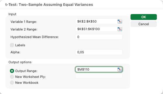 Figure 11: Setting up an independent samples t-test
Interpreting T-Test Output:
Excel produces a table with several statistics. Focus on these key values:
| Output Value | Meaning |
|---|---|
| Mean | Average score for each group |
| Variance | Spread of scores within each group |
| t Stat | The calculated t-value |
| P(T less than or equal to t) two-tail | The p-value for two-tailed test |
| t Critical two-tail | The threshold t-value for significance |
Table 11: Key output values from Excel t-test analysis and their meanings
If your p-value is less than 0.05, the difference between groups is statistically significant. If the p-value exceeds 0.05, you cannot conclude the groups differ. To determine practical significance, calculate effect size using Cohen's d or eta-squared. See our guide: How to Calculate Effect Size in Excel
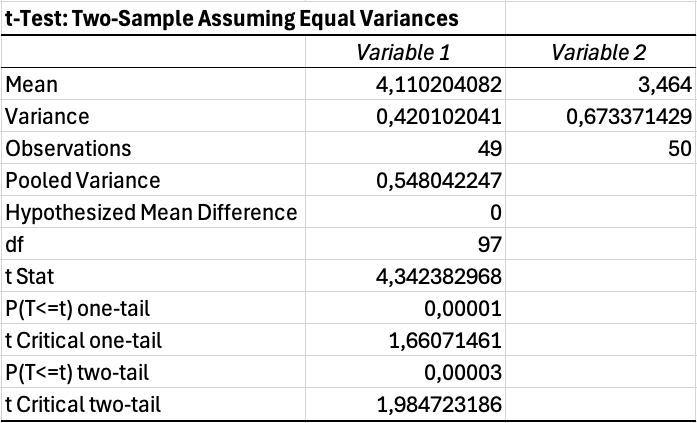 Figure 12: T-test output showing significant difference (p = 0.035)
For a complete t-test tutorial with step-by-step instructions, see our guide: T-Test in Excel: Complete Guide
Running One-Way ANOVA
When comparing three or more groups, use ANOVA instead of multiple t-tests. Running multiple t-tests inflates your Type I error rate, making false positives more likely.
Example: Comparing satisfaction scores across three age groups (18-25, 26-40, 41+)
- Organize data with each group in a separate column
- Click Data and then Data Analysis
- Select Anova: Single Factor
- Select the input range covering all group columns
- Check Labels if your first row contains headers
- Set Alpha to 0.05
- Click OK
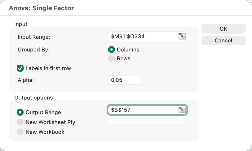 Figure 13: One-way ANOVA setup for three age groups
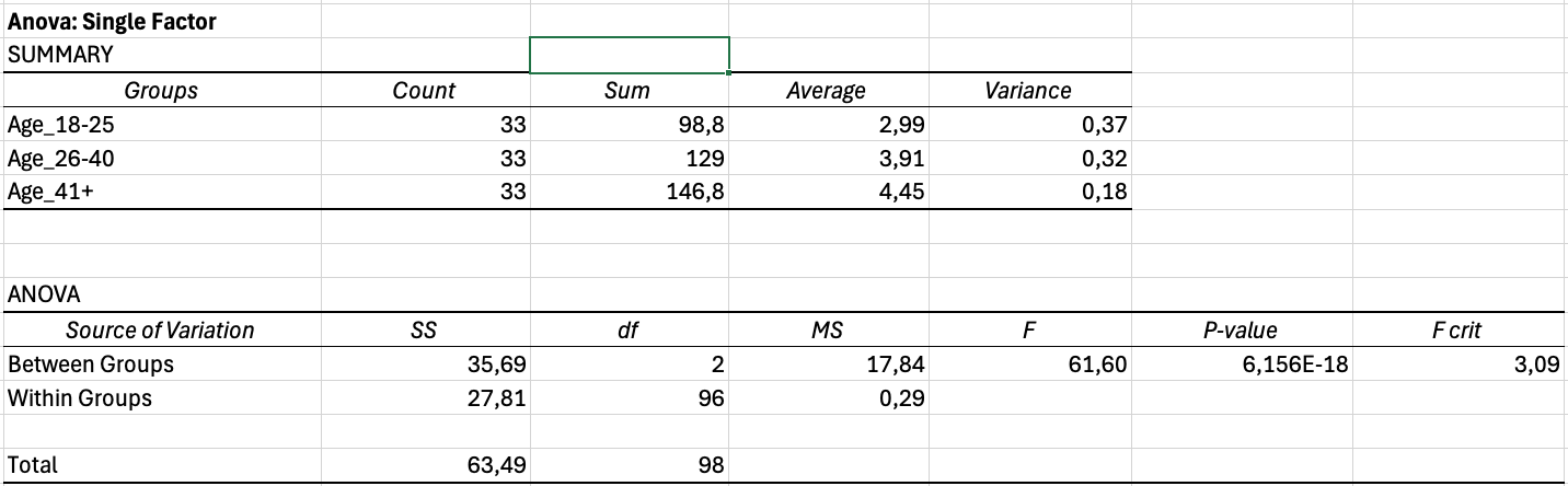 Figure 14: ANOVA output showing highly significant differences
Interpreting ANOVA Output:
The output contains two tables. The Summary table shows descriptive statistics for each group. The ANOVA table shows the test results.
Key values to report:
| Source | SS | df | MS | F | P-value |
|---|---|---|---|---|---|
| Between Groups | 12.45 | 2 | 6.22 | 4.18 | 0.018 |
| Within Groups | 144.32 | 97 | 1.49 | ||
| Total | 156.77 | 99 |
Table 12: Example ANOVA output table showing variance partitioning and significance test
If the p-value is less than 0.05, at least one group differs significantly from the others. ANOVA does not tell you which specific groups differ. For that, you need post-hoc tests (which require additional calculations or different software).
For detailed step-by-step instructions on running ANOVA with effect size calculation and APA reporting, see our complete guide: How to Calculate One-Way ANOVA in Excel
Calculating Correlation in Excel
Correlation measures the strength and direction of the relationship between two continuous variables. Use it when you want to know if higher values on one variable associate with higher (or lower) values on another.
Using the CORREL Function:
=CORREL(B2:B101,C2:C101)This calculates the Pearson correlation coefficient between the data in columns B and C.
Interpreting Correlation Coefficients:
The coefficient ranges from -1 to +1:
| Coefficient | Interpretation |
|---|---|
| 0.90 to 1.00 | Very strong positive |
| 0.70 to 0.89 | Strong positive |
| 0.40 to 0.69 | Moderate positive |
| 0.10 to 0.39 | Weak positive |
| 0.00 to 0.09 | Negligible |
| -0.10 to -0.39 | Weak negative |
| -0.40 to -0.69 | Moderate negative |
| -0.70 to -0.89 | Strong negative |
| -0.90 to -1.00 | Very strong negative |
Table 13: Interpretation guidelines for Pearson correlation coefficients
A positive coefficient means the variables move together. A negative coefficient means they move in opposite directions. The closer to 1 or -1, the stronger the relationship.
 Figure 15: Pearson correlation showing strong positive relationship (r = 0.67)
Checking Statistical Significance:
The CORREL function does not provide a p-value. To determine if your correlation is significant, compare it against critical values or use the Data Analysis Toolpak:
- Click Data and then Data Analysis
- Select Correlation
- Select your data range
- Click OK
This produces a correlation matrix but still lacks p-values. For thesis work, you may need to calculate p-values manually or use the formula for t-statistic from correlation:
Where r is the correlation coefficient and n is the sample size. Compare this t-value against critical values for your degrees of freedom (n-2).
For a detailed guide including significance testing, see: How to Calculate Pearson Correlation in Excel
Calculate Your Sample Size
Use our free calculator to determine your required sample size using Yamane, Cochran, and Krejcie & Morgan. Compare all three methods and get an APA-ready citation for your thesis.
Try CalculatorCross-Tabulation and Chi-Square Analysis
Cross-tabulation examines the relationship between two categorical variables. It answers questions like "Is there an association between gender and product preference?" or "Do different age groups choose different satisfaction levels?"
Creating a Cross-Tab with PivotTables
PivotTables provide the easiest way to create cross-tabulations in Excel.
- Select your data including headers
- Click Insert and then PivotTable
- Choose where to place the PivotTable
- Drag one variable to Rows
- Drag the other variable to Columns
- Drag either variable to Values (set to Count)
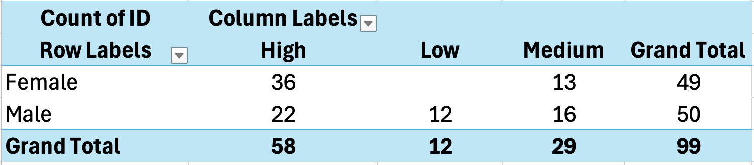 Figure 16: Creating cross-tabulation with PivotTable
Example Cross-Tab Output:
| Dissatisfied | Neutral | Satisfied | Total | |
|---|---|---|---|---|
| Male | 8 | 15 | 22 | 45 |
| Female | 5 | 18 | 32 | 55 |
| Total | 13 | 33 | 54 | 100 |
Table 14: Cross-tabulation showing relationship between gender and satisfaction level
To show percentages instead of counts:
- Click on any number in the Values area
- Right-click and select Show Values As
- Choose % of Row Total or % of Column Total
Interpreting Cross-Tab Results
Cross-tabulations reveal patterns in how categories associate. In the example above:
- 49% of males were satisfied compared to 58% of females
- Males had a higher dissatisfaction rate (18%) than females (9%)
However, these descriptive differences do not confirm a statistically significant association. For that, you need the Chi-Square test.
Chi-Square Test for Independence
The Chi-Square test determines whether the association between two categorical variables is statistically significant or likely due to chance.
Excel does not have a built-in Chi-Square test, but you can calculate it using formulas.
Step 1: Calculate Expected Frequencies
For each cell, the expected frequency is:
For the Male/Dissatisfied cell: (45 × 13) / 100 equals 5.85
Step 2: Calculate Chi-Square
Where O is observed frequency and E is expected frequency.
Create a table of expected values, then calculate the chi-square contribution for each cell and sum them.
Step 3: Determine Significance
Use the CHISQ.TEST function in Excel:
=CHISQ.TEST(ObservedRange, ExpectedRange)This returns the p-value. If less than 0.05, the association is significant.
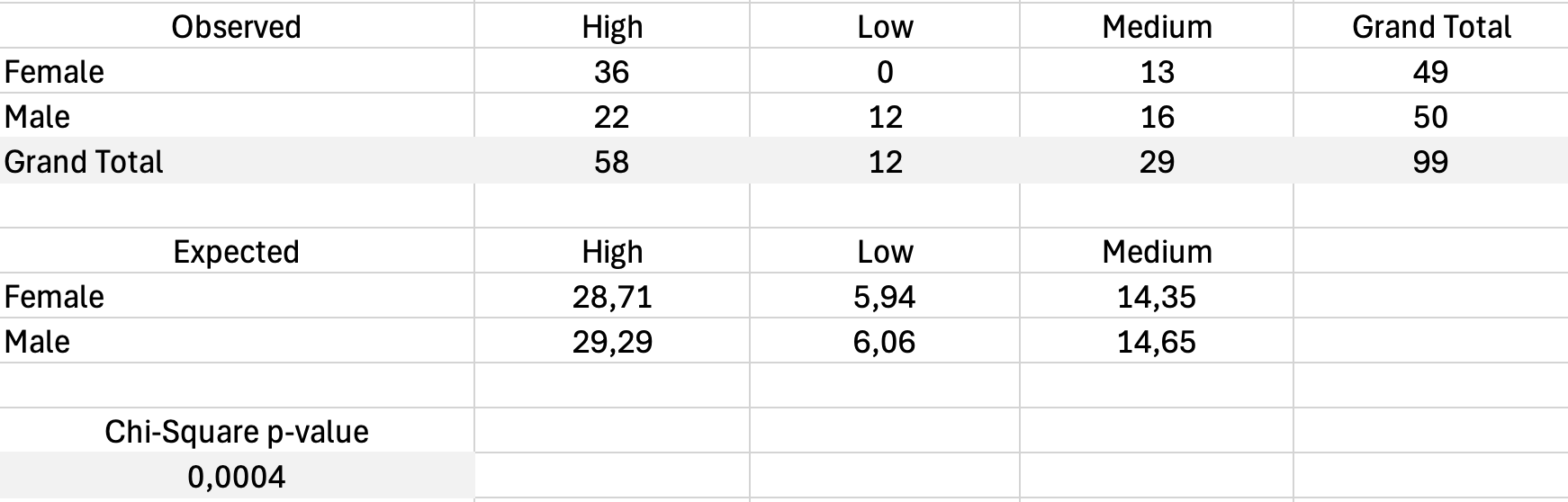 Figure 17: Chi-Square test calculation with observed and expected frequencies
Visualizing Survey Results
Charts transform numbers into patterns your readers can grasp immediately. For survey data, certain chart types communicate findings more effectively than others.
Bar Charts for Frequencies
Bar charts work best for showing how responses distribute across categories. Use them for:
- Likert scale response distributions
- Comparisons across groups
- Demographic breakdowns
Create a bar chart from your frequency table:
- Select the category labels and frequency values
- Click Insert and choose Bar Chart or Column Chart
- Format with clear labels and appropriate colors
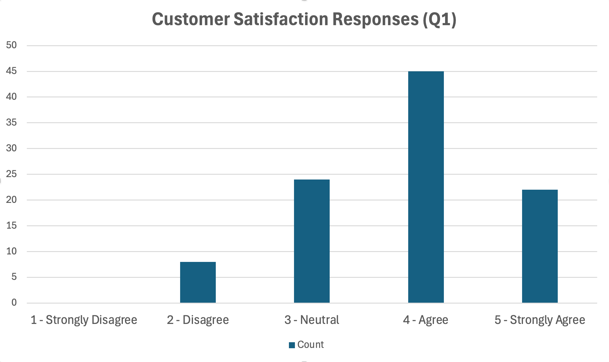 Figure 18: Bar chart displaying Likert scale response distribution
Formatting Tips:
- Use a single color or a gradient (avoid rainbow colors)
- Order bars logically (for Likert, keep the 1-5 order)
- Include data labels or a clear axis with values
- Add sample size to the title or note
Comparing Groups with Clustered Bar Charts
When comparing responses across groups, clustered bar charts place bars side by side for easy comparison.
- Create a summary table with groups as rows and response categories as columns
- Select the data and insert a Clustered Bar Chart
- Each cluster represents one response category with bars for each group
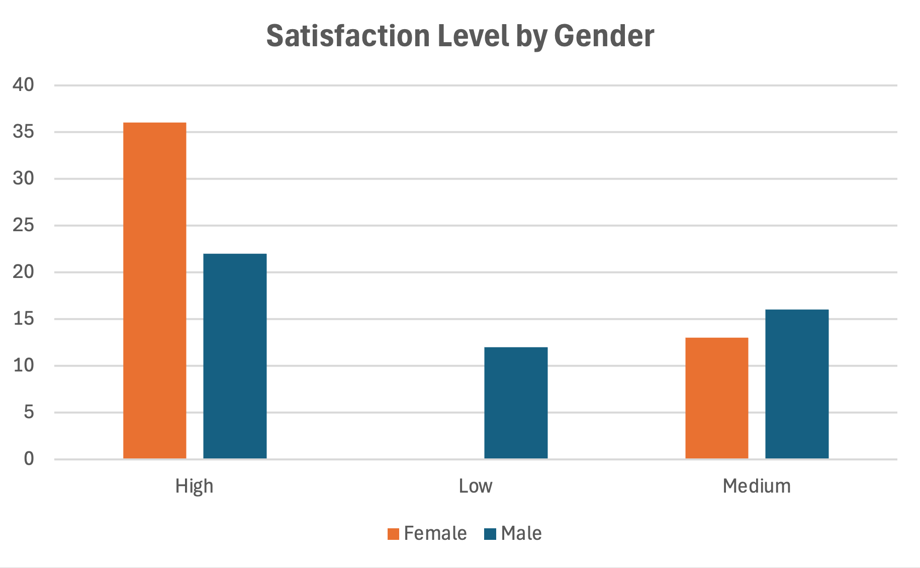 Figure 19: Clustered bar chart comparing groups
Histograms for Continuous Variables
For composite scale scores that approximate continuous data, histograms show the distribution shape.
- Use the Data Analysis Toolpak
- Select Histogram
- Specify your input range and bin range
- Check Chart Output
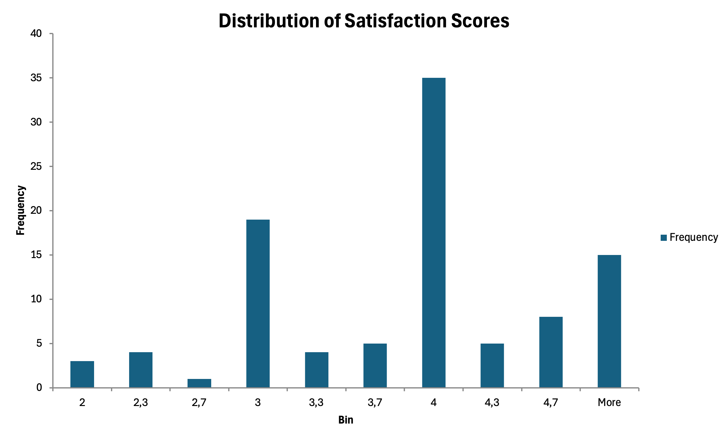 Figure 20: Histogram showing distribution of composite scale scores
Chart Formatting for Thesis
Academic charts require specific formatting:
- Remove chart junk (gridlines, borders, 3D effects)
- Use grayscale or patterns if printing in black and white
- Number figures sequentially (Figure 1, Figure 2)
- Place titles below figures in APA format
- Include notes explaining abbreviations or sample size
How to Write Results for Your Thesis
Calculating statistics is only half the work. Communicating results clearly determines whether your thesis committee understands your findings. This section provides templates you can adapt for your own results.
APA Format Basics
Most academic disciplines use APA format for reporting statistics. Key conventions:
- Italicize statistical symbols: M, SD, t, F, r, p
- Report exact p-values to three decimal places (p equals .034)
- Use leading zero for statistics that can exceed 1 (M equals 0.75)
- No leading zero for statistics bounded by 1 (r equals .67, p equals .034)
- Round to two decimal places unless more precision is needed
Reporting Descriptive Statistics
For a single variable:
Participants reported moderately high satisfaction with the service (M equals 3.67, SD equals 0.82).
For grouped variables:
Male participants (M equals 3.52, SD equals 0.79) reported lower satisfaction than female participants (M equals 3.78, SD equals 0.84).
In a table:
Table 2 presents descriptive statistics for all study variables.
Reporting T-Test Results
Significant result:
An independent samples t-test revealed a significant difference in satisfaction between male (M equals 3.52, SD equals 0.79) and female (M equals 3.78, SD equals 0.84) participants, t(98) equals -2.14, p equals .035.
Non-significant result:
The difference in satisfaction between male (M equals 3.52, SD equals 0.79) and female (M equals 3.58, SD equals 0.81) participants was not statistically significant, t(98) equals -0.42, p equals .677.
The format follows: t(degrees of freedom) equals t-value, p equals p-value
Reporting ANOVA Results
Significant result:
A one-way ANOVA indicated significant differences in satisfaction across age groups, F(2, 97) equals 4.18, p equals .018.
With post-hoc:
Post-hoc comparisons using Tukey's test revealed that participants aged 41 and older (M equals 4.02, SD equals 0.72) reported significantly higher satisfaction than those aged 18-25 (M equals 3.45, SD equals 0.89), p equals .014. The 26-40 age group (M equals 3.68, SD equals 0.78) did not differ significantly from either group.
Reporting Correlation Results
Significant correlation:
There was a strong positive correlation between customer satisfaction and brand loyalty, r(98) equals .67, p less than .001. Higher satisfaction was associated with greater loyalty.
Non-significant correlation:
The relationship between satisfaction and age was not statistically significant, r(98) equals .12, p equals .231.
Reporting Reliability
Single scale:
The Customer Satisfaction scale demonstrated good internal consistency (Cronbach's α equals .84).
Multiple scales:
Internal consistency was acceptable for all scales: Customer Satisfaction (α equals .84), Purchase Intention (α equals .78), and Brand Loyalty (α equals .91).
Copy-Paste Templates
Here are fill-in-the-blank templates for common analyses:
Descriptive Statistics Template:
Participants scored [high/moderate/low] on [variable name] (M equals [mean], SD equals [SD]).
T-Test Template:
An independent samples t-test [revealed/did not reveal] a significant difference in [DV] between [Group 1] (M equals [mean], SD equals [SD]) and [Group 2] (M equals [mean], SD equals [SD]), t([df]) equals [t-value], p equals [p-value].
ANOVA Template:
A one-way ANOVA [indicated/did not indicate] significant differences in [DV] across [grouping variable], F([df1], [df2]) equals [F-value], p equals [p-value].
Correlation Template:
There was a [strong/moderate/weak] [positive/negative] correlation between [Variable 1] and [Variable 2], r([df]) equals [r-value], p equals [p-value].
Common Mistakes to Avoid
Even experienced researchers make errors when analyzing survey data. Learning from common mistakes helps you produce more credible results. For an in-depth guide to the 10 most common errors and how to fix them, see: Common Mistakes in Survey Analysis (Excel) & How to Fix Them
Mistake 1: Using the Wrong Test
Choosing a statistical test based on what you want to find rather than what your data supports leads to invalid conclusions. Always let your research question and data type guide test selection. A t-test requires continuous dependent variables. Chi-square requires categorical variables. Mixing these produces meaningless results.
Mistake 2: Ignoring Assumptions
Parametric tests assume normal distribution and equal variances. Skipping assumption checks does not make violations disappear. Check normality using histograms or the Shapiro-Wilk test. Check variance homogeneity using Levene's test. When assumptions are violated, use non-parametric alternatives or transformations.
Mistake 3: P-Hacking
Running multiple tests until finding significance, then only reporting those results, inflates false positive rates. If you test 20 relationships at α equals .05, you expect one significant result by chance alone. Report all analyses conducted, even non-significant ones. Consider adjusting for multiple comparisons using Bonferroni correction.
Mistake 4: Confusing Correlation with Causation
A significant correlation between satisfaction and loyalty does not prove that satisfaction causes loyalty. The relationship could be reversed (loyalty causes satisfaction) or both could be caused by a third variable. Only experimental designs with random assignment can establish causation.
Mistake 5: Overinterpreting Small Sample Results
Statistical tests with small samples (under 30 participants) have low power, meaning they may miss real effects. They also produce unstable estimates that may not replicate. Be cautious about generalizing from small samples. Report sample size limitations in your discussion section.
Mistake 6: Forgetting to Check Reliability Before Analysis
Using unreliable scales invalidates all subsequent analyses. A scale with α equals .55 introduces so much measurement error that any relationships you find are questionable. Always check and report Cronbach's Alpha before conducting hypothesis tests.
Mistake 7: Not Addressing Missing Data
Ignoring missing values or handling them inconsistently creates bias. Document how many cases had missing data, which variables were affected, and how you addressed the issue. Common approaches include listwise deletion, pairwise deletion, and mean imputation. Each has tradeoffs you should acknowledge.
Excel Template: Survey Analysis Toolkit
To help you apply these techniques, we created an Excel template with pre-built formulas for common survey analyses.
What the template includes:
- Data entry sheet with proper structure
- Automatic Cronbach's Alpha calculation
- Descriptive statistics summary
- Frequency table generator
- T-test calculator
- Correlation matrix
- Chart templates
How to use:
- Download the template from the sidebar
- Enter your survey responses in the Data sheet
- The Summary sheet automatically calculates key statistics
- Use the Analysis sheet for hypothesis testing
- Copy chart templates and update with your data
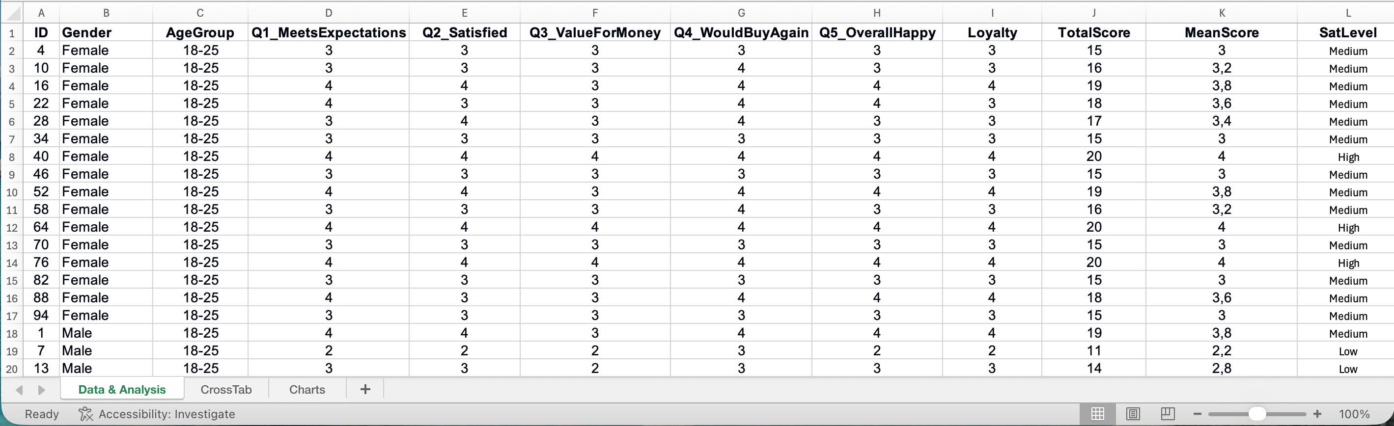 Figure 21: Survey Analysis Excel Template with automated calculations
Download the Survey Analysis Excel Template
Frequently Asked Questions
Next Steps
You now have a complete workflow for analyzing survey data in Excel. From preparing your data through reporting results, each step builds toward a credible thesis.
Complete Statistics in Excel Series:
Reliability & Interpretation:
- How to Calculate Cronbach's Alpha in Excel - Step-by-step reliability calculation
- How to Interpret Cronbach's Alpha Results - Understanding your reliability values
- How to Report Cronbach's Alpha in APA Format - Thesis formatting guide
Hypothesis Testing:
- T-Test in Excel: Complete Guide - Independent and paired t-tests
- T-Test vs ANOVA: Which Test Should You Use? - Decision framework
- How to Calculate One-Way ANOVA in Excel - Compare 3+ groups
- How to Calculate Effect Size in Excel - Cohen's d and eta-squared
Descriptive Statistics & Correlation:
- Descriptive Statistics in Excel: The Ultimate Guide - Mean, median, mode, and more
- How to Report Descriptive Statistics in APA Format - Thesis tables
- How to Create Frequency Tables in Excel - Distribution analysis
- How to Calculate Pearson Correlation in Excel - Relationship analysis
Regression Analysis:
- How to Calculate Simple Linear Regression in Excel - Single predictor models
- How to Do Multiple Regression in Excel - Multiple predictor models
Data Quality & Troubleshooting:
- How to Handle Missing Data in Excel - Data cleaning strategies
- Common Mistakes in Survey Analysis (Excel) - Avoid costly errors
Ready for SPSS?
If your analysis requires features beyond Excel's capabilities, explore our SPSS tutorials:
- How to Calculate Cronbach's Alpha in SPSS
- How to Run Mediation Analysis in SPSS
- How to Perform Moderation Analysis in SPSS
References
Pallant, J. (2016). SPSS Survival Manual (6th ed.). McGraw-Hill Education.