Frequency tables are fundamental tools for presenting categorical data in thesis and dissertation research. Whether you're reporting demographic characteristics, survey responses, or experimental conditions, your committee expects to see clear frequency distributions in Chapter 4 (Results). Understanding how to create accurate, professional frequency tables in Excel is essential for any researcher working with survey data.
This guide covers four methods for creating frequency tables in Excel, from simple COUNTIF formulas to advanced cross-tabulations. You'll learn which method to use for different data types, how to calculate percentages correctly, and how to format tables according to APA guidelines. Each method includes step-by-step instructions with Excel formulas you can adapt for your own research.
You will learn:
- When to use frequency tables for categorical vs continuous data
- Four methods to create frequency tables (COUNTIF, Pivot Tables, FREQUENCY function, cross-tabulation)
- How to calculate absolute frequency, relative frequency, and cumulative frequency
- APA formatting guidelines for reporting frequency tables in your thesis
- Common mistakes to avoid when analyzing survey responses
These techniques apply whether you're analyzing Likert scale responses, demographic variables, or any categorical data in your dissertation research.
Sample Dataset for This Tutorial
Throughout this guide, we'll use a sample student survey dataset with 35 responses. This dataset includes both categorical variables (Gender, Satisfaction, Department) and continuous data (Test_Score), allowing us to demonstrate all four frequency table methods.
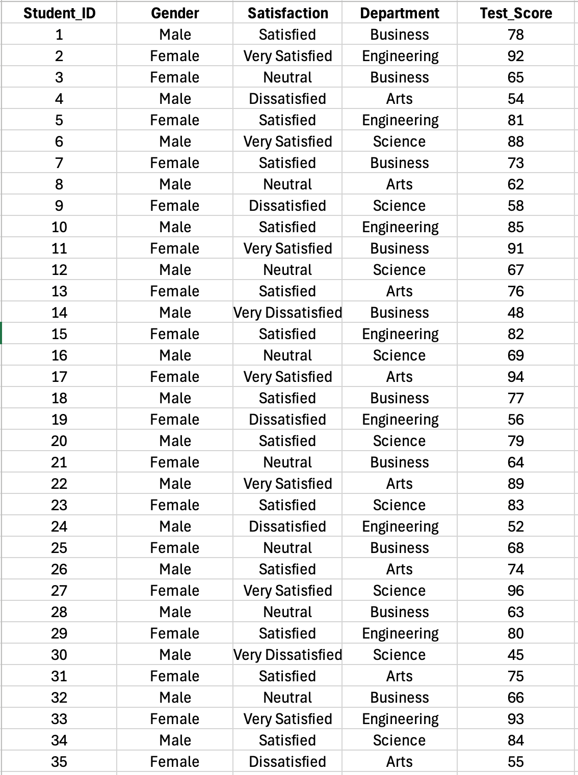
Figure 1: Sample student survey dataset with 35 responses including categorical variables (Gender, Satisfaction, Department) and continuous data (Test Score) used throughout this tutorial
The dataset contains:
- Student_ID: Unique identifier for each respondent
- Gender: Male or Female (categorical, nominal)
- Satisfaction: 5-point Likert scale from Very Dissatisfied to Very Satisfied (categorical, ordinal)
- Department: Business, Engineering, Arts, or Science (categorical, nominal)
- Test_Score: Continuous scores ranging from 45 to 96 (for FREQUENCY function and Toolpak examples)
You can create a similar dataset from your own survey data or use this structure as a template.
Understanding Frequency Tables for Research
A frequency table displays the distribution of responses across categories by showing how many times each value appears in your dataset. For categorical variables like gender, education level, or Likert scale responses, frequency tables answer questions such as "How many respondents selected each option?" and "What percentage of participants fall into each category?"
When to Use Frequency Tables
Frequency tables are appropriate for categorical (nominal or ordinal) data where responses fall into distinct categories. They are essential for:
Demographic variables: Gender, age groups, education level, occupation, ethnicity Likert scale responses: Survey items measuring agreement (Strongly Disagree to Strongly Agree) Multiple choice responses: Yes/No questions, preference selections, categorical outcomes Grouped continuous data: Age ranges (18-25, 26-35), income brackets, score ranges
Frequency tables are typically not appropriate for continuous variables like exact age (23 years old) or income ($47,532) unless you group the data into meaningful intervals first.
Types of Frequency Information
Absolute frequency (n): The count of observations in each category. Example: 45 respondents selected "Agree"
Relative frequency (%): The percentage of observations in each category. Example: 45 out of 200 equals 22.5%
Cumulative frequency: The running total of frequencies from lowest to highest category. Useful for ordinal data like Likert scales to see what percentage scored at or below a certain point.
For thesis research, you typically report both absolute and relative frequencies to give readers complete information about your sample distribution.
Method 1: COUNTIF Function for Simple Categorical Data
The COUNTIF function counts how many cells in a range meet a specific criterion. This method works best for categorical variables with a limited number of distinct values, such as Likert scale items with 5-7 response options.
When to Use COUNTIF
COUNTIF is ideal when you have:
- Simple categorical variables with 5-10 distinct values
- Likert scale data (1 to 5 or 1 to 7)
- Binary responses (Yes/No, Male/Female)
- Small to medium datasets where manual setup is manageable
COUNTIF is less efficient for variables with many categories or when analyzing multiple variables simultaneously (use Pivot Tables instead).
Step-by-Step: Creating a Frequency Table with COUNTIF
Using our sample dataset, Column C contains Satisfaction ratings (Very Dissatisfied, Dissatisfied, Neutral, Satisfied, Very Satisfied) for 35 respondents in rows 2 through 36.
Step 1: Create the summary table structure
In a blank area of your worksheet (columns G-H in our example), set up your frequency table:
- Column G: Category labels (Very Dissatisfied, Dissatisfied, etc.)
- Column H: Frequency (counts)
Step 2: Count frequencies with COUNTIF
In cell H2 (next to "Very Dissatisfied"), enter:
=COUNTIF($C$2:$C$36,"Very Dissatisfied")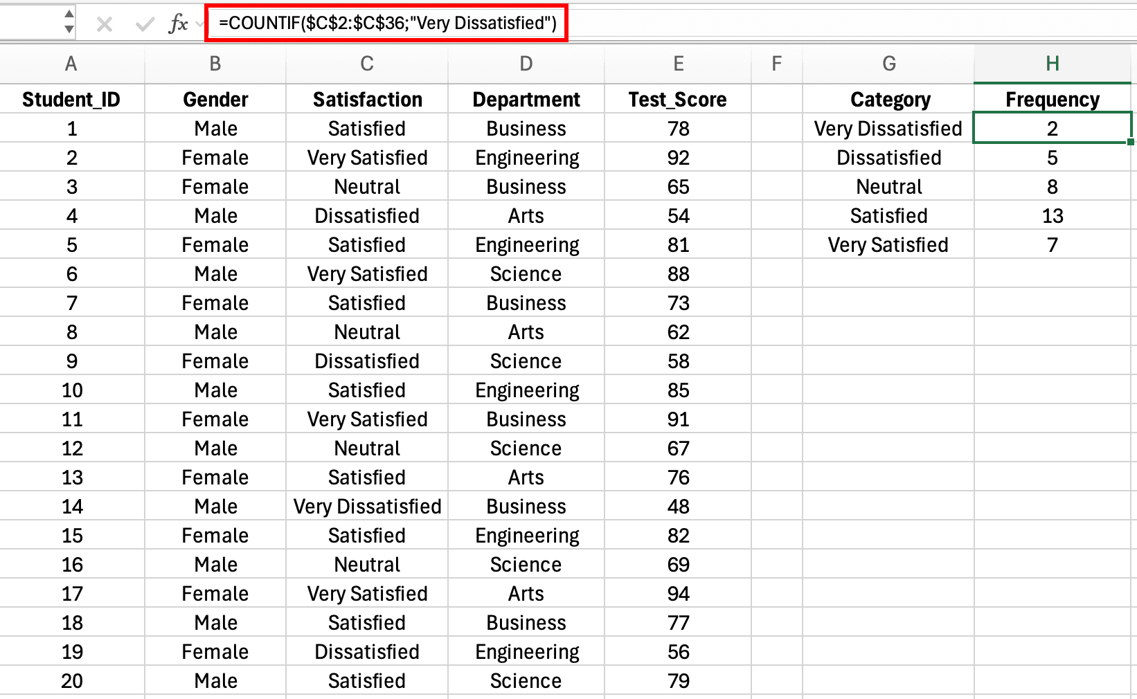
Figure 2: COUNTIF formula counting satisfaction ratings with absolute references for the data range
This counts how many cells in C2:C36 contain the text "Very Dissatisfied". The dollar signs create absolute references for the data range (C2:C36), which means when you copy the formula down, this range stays fixed while you can change the criteria for each category.
Note on Regional Settings: Excel formulas use different argument separators depending on your locale. US/UK Excel uses commas:
=COUNTIF($C$2:$C$36,"Very Dissatisfied")while European Excel uses semicolons:=COUNTIF($C$2:$C$36;"Very Dissatisfied"). If a formula returns an error, try swapping commas for semicolons (or vice versa). To check or change your settings:
- Windows: File → Options → Advanced → Editing options → "Use system separators"
- Mac: System Preferences → Language & Region → Advanced → Number separators
Copy this formula down to H3:H6, updating the text criteria for each satisfaction category: "Dissatisfied", "Neutral", "Satisfied", and "Very Satisfied".
Step 3: Calculate percentages
You can add a percentage column in Column I. In cell I2, enter:
=H2/SUM($H$2:$H$6)*100This divides the count in H2 by the total of all counts, then multiplies by 100 to get a percentage. The dollar signs lock the sum range so you can copy the formula down.
Copy this formula to I3:I6. Format these cells as percentages or numbers with one decimal place.
Step 4: Add a total row
In row 7:
- G7: "Total"
- H7:
=SUM(H2:H6)(should equal 35) - I7:
=SUM(I2:I6)(should equal 100%)
Your complete frequency table should look like this:
| Response Value | Frequency (n) | Percentage (%) |
|---|---|---|
| 1 - Very Dissatisfied | 12 | 6.0 |
| 2 - Dissatisfied | 28 | 14.0 |
| 3 - Neutral | 65 | 32.5 |
| 4 - Satisfied | 71 | 35.5 |
| 5 - Very Satisfied | 24 | 12.0 |
| Total | 200 | 100.0 |
Table 1: Frequency distribution of satisfaction ratings created using COUNTIF formula
COUNTIF for Multiple Categories
For variables with text responses like gender, use COUNTIF with text criteria:
=COUNTIF($C$2:$C$201,"Male")
=COUNTIF($C$2:$C$201,"Female")
=COUNTIF($C$2:$C$201,"Non-binary")
Enclose text criteria in quotation marks. This method requires you to know all possible response categories in advance.
Common COUNTIF Mistakes to Avoid
Incorrect range references: Using B2:B201 without dollar signs causes the range to shift when you copy the formula down, producing incorrect counts.
Mismatched data types: If your data contains numbers but you're counting text ("1" instead of 1), COUNTIF returns zero. Check that your criteria matches your data type.
Typos in text criteria: =COUNTIF(range,"Feemale") won't match "Female". Text must match exactly, including capitalization in some Excel versions.
Forgetting to include all responses: If your Likert scale uses 1-7 but you only count 1-5, you'll miss responses and percentages won't sum to 100%.
Method 2: Pivot Tables for Flexible Analysis
Pivot Tables provide the most powerful and flexible way to create frequency tables in Excel. They automatically count categories, calculate percentages, and allow you to analyze multiple variables simultaneously without writing formulas.
When to Use Pivot Tables
Pivot Tables are ideal for:
- Large datasets with hundreds or thousands of responses
- Multiple variables you want to analyze quickly
- Cross-tabulation (frequency of two variables together)
- Exploratory analysis where you're not sure which variables to examine
- Data that changes frequently (easy to refresh the table)
Step-by-Step: Creating a Frequency Table with Pivot Tables
Assume you have survey data with headers in row 1 and responses starting in row 2. Column headers include "Gender", "Age_Group", "Satisfaction", etc.
Step 1: Select your data
Click any cell within your data range. Excel will automatically detect the extent of your data when you create the Pivot Table.
Step 2: Insert Pivot Table
- Click the Insert tab
- Click PivotTable
- In the dialog box, verify the data range is correct
- Choose New Worksheet for the Pivot Table location
- Click OK
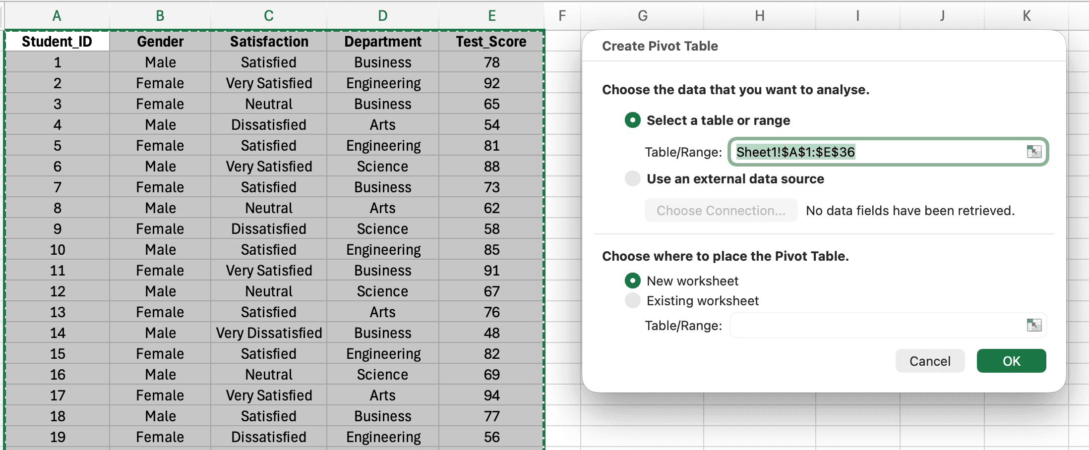
Figure 3: Create PivotTable dialog showing data range selection and worksheet placement options
Excel creates a new worksheet with the Pivot Table Fields pane on the right.
Step 3: Build the frequency table
To create a frequency table for the Satisfaction variable:
- In the PivotTable Fields pane, find Satisfaction
- Drag Satisfaction to the Rows area (or check the box, which usually adds it to Rows automatically)
- Drag Satisfaction again to the Values area
- Excel automatically sets this to "Count of Satisfaction"
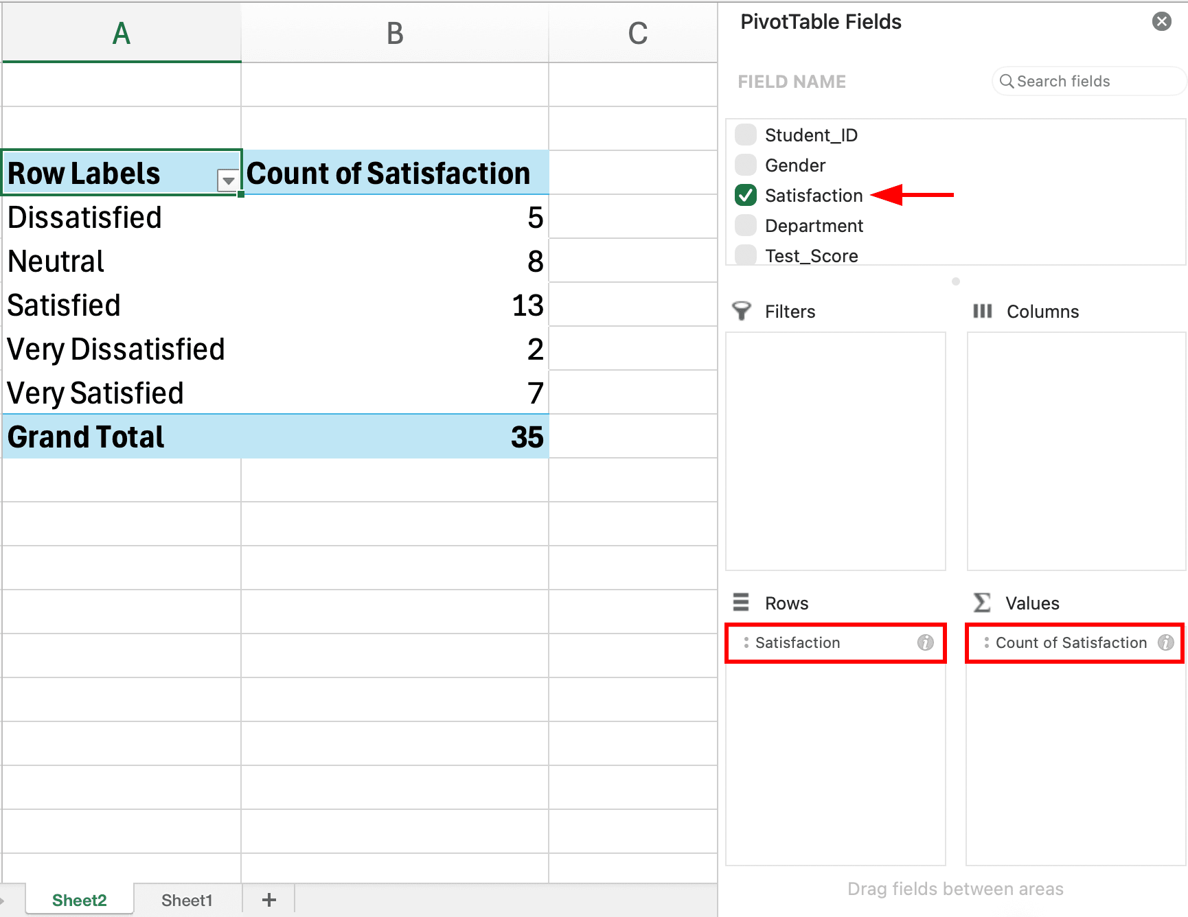
Figure 4: PivotTable Fields pane showing Satisfaction in Rows and Values areas with the resulting frequency table
Your Pivot Table now displays each satisfaction level with its frequency count.
Step 4: Add percentages
To show percentages alongside counts:
- Right-click any number in the Values column
- Select Show Values As
- Choose % of Grand Total
Alternatively, drag Satisfaction to the Values area a second time, then format this second instance as % of Grand Total. This gives you both count and percentage in adjacent columns.
Step 5: Format and refine
- Click the sum of values dropdown (in the Values area) and select Value Field Settings to rename columns
- Right-click row labels to sort ascending/descending
- Use Design tab to apply professional table styles
- Add a total row by checking Grand Totals in the Design tab
Creating Cross-Tabulation with Pivot Tables
Cross-tabulation shows the frequency distribution of two categorical variables simultaneously. For example, satisfaction level (columns) by gender (rows).
To create a cross-tabulation:
- Create a Pivot Table as described above
- Drag one variable (e.g., Gender) to Rows
- Drag another variable (e.g., Satisfaction) to Columns
- Drag either variable to Values (set to Count)
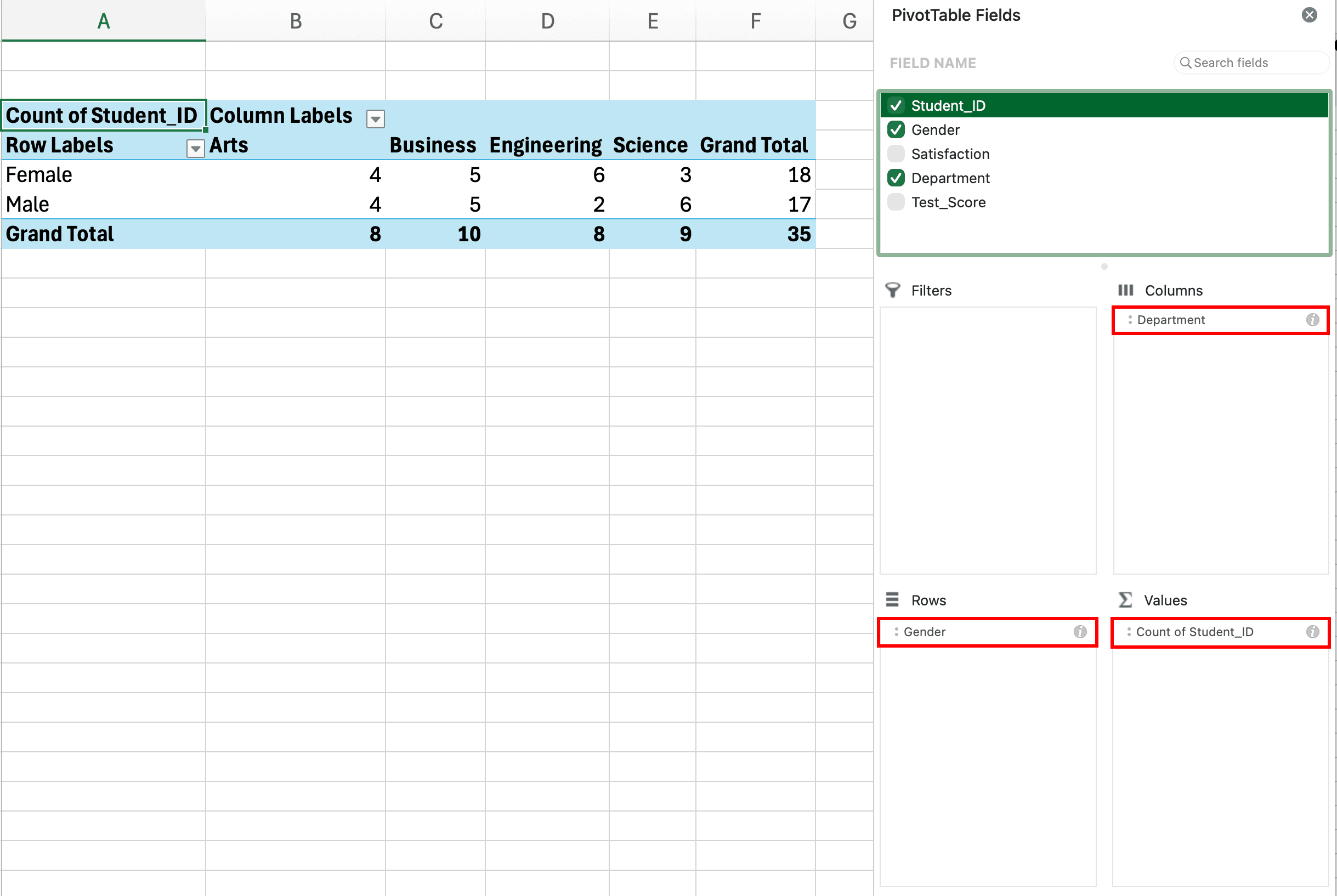
Figure 5: PivotTable Fields pane showing Gender in Rows and Satisfaction in Columns to create a cross-tabulation frequency table
The resulting table shows how responses are distributed across both variables. Example output:
| Very Dissatisfied | Dissatisfied | Neutral | Satisfied | Very Satisfied | Total | |
|---|---|---|---|---|---|---|
| Male | 5 | 12 | 28 | 32 | 11 | 88 |
| Female | 7 | 16 | 37 | 39 | 13 | 112 |
| Total | 12 | 28 | 65 | 71 | 24 | 200 |
Table 2: Cross-tabulation of gender by satisfaction level using Pivot Table
This crosstab reveals whether satisfaction ratings differ between male and female respondents, which is common analysis for thesis research.
Pivot Table Advantages for Survey Analysis
Pivot Tables offer significant advantages over manual formulas:
Speed: Create frequency tables for multiple variables in seconds by dragging fields Flexibility: Rearrange rows, columns, and filters without rewriting formulas Automatic updates: Refresh the Pivot Table when your source data changes Built-in calculations: Access percentages, running totals, and other calculations through right-click menus Professional appearance: Apply table styles instantly
For dissertation research with dozens of survey items, Pivot Tables save hours compared to creating individual COUNTIF tables for each variable.
Method 3: FREQUENCY Function for Grouped Data
The FREQUENCY function is designed specifically for grouping continuous data into intervals (bins) and counting how many values fall into each bin. This method is essential when working with continuous variables like age, income, or test scores that you need to present in grouped frequency tables.
When to Use the FREQUENCY Function
Use FREQUENCY when you have:
- Continuous data to group into meaningful intervals (age: 18-25, 26-35, 36-45, etc.)
- Test scores or measurements to categorize into ranges
- Data that's technically discrete but has many unique values (like age in years)
FREQUENCY creates true grouped frequency distributions required for proper statistical analysis of continuous variables.
Understanding Bins for Grouped Frequency Tables
Bins are the upper limits of each interval. For age groups 18-25, 26-35, 36-45, 46-55, 56+, your bins would be: 25, 35, 45, 55, 65 (assuming 65 is your maximum age).
The FREQUENCY function counts:
- How many values are ≤ 25 (first bin)
- How many values are > 25 and ≤ 35 (second bin)
- How many values are > 35 and ≤ 45 (third bin)
- And so on
Step-by-Step: Creating a Grouped Frequency Table
Using our sample dataset, Column E contains Test_Score values (ranging from 45 to 96) for 35 students in rows 2 through 36.
Step 1: Create your bin array
In Column J, list your bin upper limits for test score ranges:
- J2: 50
- J3: 60
- J4: 70
- J5: 80
- J6: 90
- J7: 100
Step 2: Select the output range
Select cells K2:K8 (one more cell than you have bins, because FREQUENCY returns one extra count for values above the last bin).
Step 3: Enter the FREQUENCY array formula
With K2:K8 selected, type:
=FREQUENCY(E2:E36,J2:J7)Where E2:E36 is your Test_Score data and J2:J7 are your bins.
Press Ctrl+Shift+Enter (not just Enter). This enters it as an array formula, and Excel will add curly braces: {=FREQUENCY(E2:E36,J2:J7)}
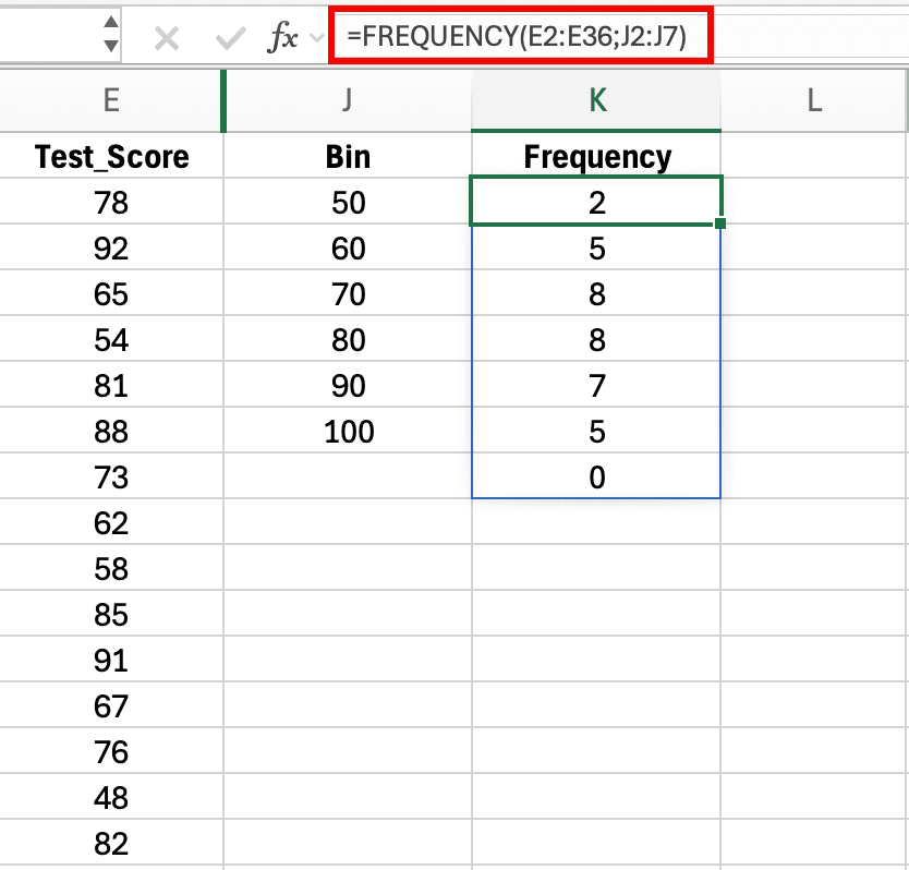
Figure 6: FREQUENCY array formula with bin ranges and resulting frequency counts for grouped data
Excel populates all selected cells with the frequency count for each bin.
Step 4: Label and format
Add meaningful labels in Column I for test score ranges:
- I2: "≤50" (scores 50 and below)
- I3: "51-60"
- I4: "61-70"
- I5: "71-80"
- I6: "81-90"
- I7: "91-100"
- I8: "Above 100" (if any scores exceed 100)
Add a percentage column in Column L using =K2/SUM($K$2:$K$8)*100 and copy down.
Grouped Frequency Table Example
Your final table:
| Age Group | Frequency (n) | Percentage (%) |
|---|---|---|
| 18-25 | 42 | 21.0 |
| 26-35 | 68 | 34.0 |
| 36-45 | 51 | 25.5 |
| 46-55 | 28 | 14.0 |
| 56-65 | 9 | 4.5 |
| 66+ | 2 | 1.0 |
| Total | 200 | 100.0 |
Table 3: Grouped frequency distribution for age using FREQUENCY function
Choosing Appropriate Bin Intervals
The number and width of bins affects how your distribution appears. Guidelines for bin selection:
Equal width intervals: Use equal-width bins (10-year age groups) for consistency unless your data has natural groupings
5-10 bins typically: Too few bins (2-3) hide important patterns; too many bins (15+) create sparse categories with small frequencies
Meaningful boundaries: Choose bins that make sense for your field (decades for age, income brackets that match census categories)
Consider sample size: With small samples (n < 100), use fewer, wider bins to avoid categories with very small frequencies
FREQUENCY Function Limitations
The FREQUENCY function has some constraints:
Array formula requirement: Must be entered with Ctrl+Shift+Enter, and you cannot edit individual cells in the output range
Static bins: If you change bin values, you must re-enter the entire array formula
Cannot handle text: FREQUENCY only works with numeric data
For these reasons, many researchers prefer Pivot Tables even for grouped data, using Pivot Table grouping features instead of the FREQUENCY function.
Method 4: Data Analysis Toolpak for Frequency Tables with Histograms
The Data Analysis Toolpak is an Excel add-in that automates statistical calculations, including frequency distributions. This method is particularly useful when you want both a frequency table and histogram chart generated simultaneously.
Enabling the Data Analysis Toolpak
The Toolpak is not enabled by default. To activate it:
- Click File → Options → Add-ins
- In the Manage dropdown at the bottom, select Excel Add-ins and click Go
- Check Analysis ToolPak and click OK
- The Data Analysis button now appears in the Data tab
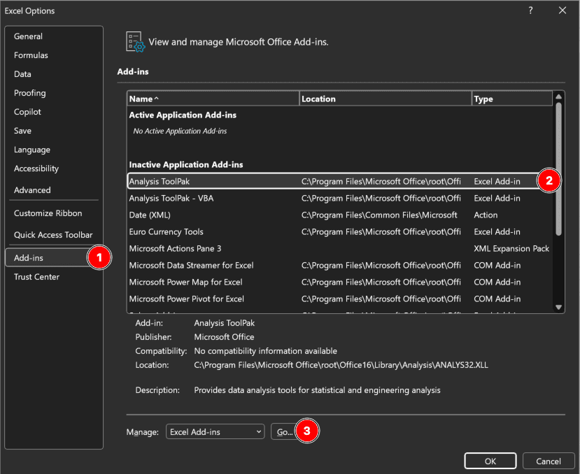
Figure 7: Excel Add-ins dialog showing how to enable the Analysis ToolPak for creating frequency distributions and histogram charts
This is a one-time setup. Once enabled, the Toolpak remains available for all future workbooks.
Step-by-Step: Creating a Frequency Table with the Toolpak
Using our sample dataset, we'll create a frequency distribution for the Satisfaction variable (Column E) with bin ranges in Column J.
Step 1: Set up your bins
In a separate column (Column J in our example), list your bin upper limits for the satisfaction ratings: 1, 2, 3, 4, 5, corresponding to Very Dissatisfied through Very Satisfied.
Step 2: Open the Histogram tool
Click Data → Data Analysis → Histogram → OK
Step 3: Configure the dialog box
- Input Range: Select your satisfaction data (E2:E36 in our sample dataset)
- Bin Range: Select your bins (J2:J7)
- Output Range: Choose where results should appear, or select New Worksheet
- Check Chart Output to generate a histogram alongside your frequency table
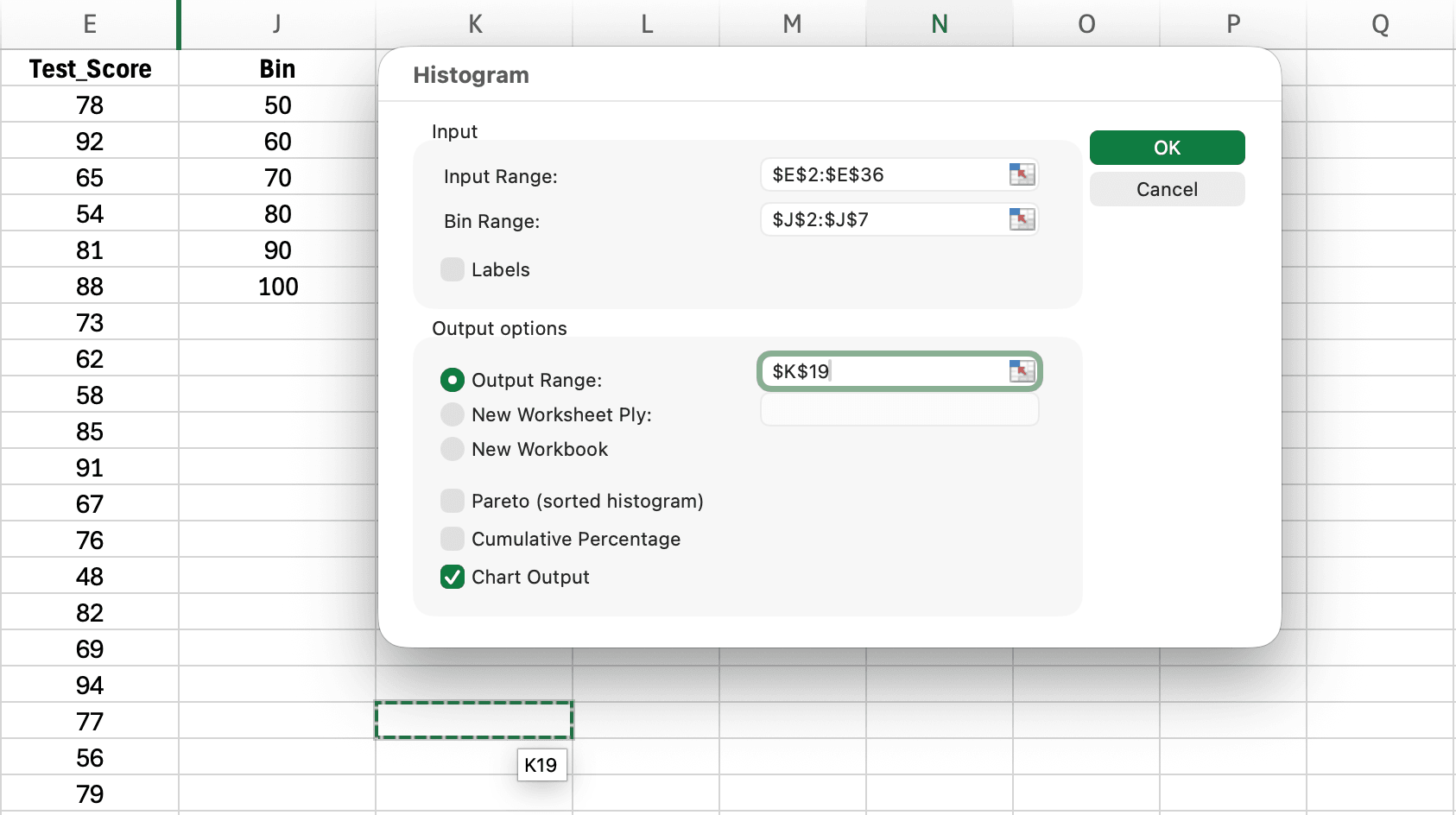
Figure 8: Histogram dialog showing input range, bin range, output options, and chart output settings for creating frequency distributions
Click OK and Excel produces both the frequency distribution and a histogram chart.
Data Analysis Toolpak Output
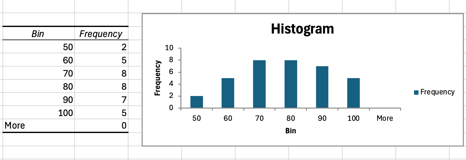
Figure 9: Histogram output from Data Analysis Toolpak displaying frequency distribution table and corresponding histogram chart for test scores
The Histogram tool generates a table with two columns (Bin and Frequency) and automatically creates a histogram chart. The "More" row shows values exceeding your highest bin (should be zero if bins cover all values). The chart can be formatted and included in your thesis appendix or results chapter.
When to Use the Data Analysis Toolpak
This method works best when:
- You need a histogram chart for your thesis appendix or results chapter
- Your thesis advisor specifically requires Toolpak output (common in business and social science programs)
- You want quick visual inspection of your data distribution before detailed analysis
However, the Toolpak has limitations: it creates static output that does not update when source data changes, and it requires the add-in to be installed on any computer where you open the workbook. For dynamic analysis or sharing files with committee members, Pivot Tables offer more flexibility.
Creating Cross-Tabulation Tables
Cross-tabulation (crosstab) displays the joint frequency distribution of two categorical variables. This analysis is essential for examining relationships between variables, comparing subgroups, and exploring patterns in survey data.
When Cross-Tabulation is Needed for Thesis Research
Your committee expects cross-tabulation when:
Comparing demographic groups: Do satisfaction levels differ by gender? By age group? By education level?
Examining variable relationships: Is there an association between teaching method and test performance category?
Reporting subgroup patterns: How do responses to one survey item relate to responses on another item?
Testing hypotheses: Before running chi-square tests, you need the crosstab showing observed frequencies
Cross-tabulation is typically a precursor to inferential statistics (chi-square test of independence) but is valuable as descriptive analysis on its own.
Creating Cross-Tabulation with Pivot Tables (Recommended)
The most efficient method for crosstabs is Pivot Tables.
Step 1: Insert Pivot Table
Follow the earlier Pivot Table steps (Insert → PivotTable → New Worksheet).
Step 2: Set up the crosstab
- Drag one variable to Rows (e.g., Gender: Male, Female, Non-binary)
- Drag second variable to Columns (e.g., Satisfaction: 1-5)
- Drag either variable to Values (Excel sets it to Count)
Excel creates a two-way frequency table automatically.
Step 3: Add row and column percentages (optional)
For more detailed analysis:
- Right-click a value, select Show Values As → % of Row Total to see what percentage of each row (each gender) falls in each column (each satisfaction level)
- Or choose % of Column Total to see what percentage of each satisfaction level comes from each gender
- Or keep % of Grand Total to see what percentage of the total sample falls in each cell
Interpreting Cross-Tabulation Results
Consider this example crosstab of Gender by Satisfaction Level:
| Very Dissatisfied | Dissatisfied | Neutral | Satisfied | Very Satisfied | Total | |
|---|---|---|---|---|---|---|
| Male | 5 (5.7%) | 12 (13.6%) | 28 (31.8%) | 32 (36.4%) | 11 (12.5%) | 88 (100%) |
| Female | 7 (6.3%) | 16 (14.3%) | 37 (33.0%) | 39 (34.8%) | 13 (11.6%) | 112 (100%) |
Table 4: Cross-tabulation with row percentages showing gender by satisfaction level
Row percentages show that satisfaction distributions are similar for males and females. Both groups have roughly one-third neutral, one-third satisfied, with smaller percentages at the extremes. This suggests gender may not strongly relate to satisfaction in this sample.
Formatting Cross-Tabs for APA Style
APA format for cross-tabulation tables:
Table number and title: Table 2 (number), Cross-Tabulation of Gender and Satisfaction Level (descriptive title in italics)
Clear labels: Row and column headers clearly identify variables and categories
Report frequencies and percentages: Include both n and % in each cell, formatted as: n (%)
Include totals: Row totals and column totals with grand total in bottom-right cell
Add a note if needed: Explain what percentages represent (row %, column %, or % of total)
Example APA table note:
Note. Percentages represent row percentages (percentage of each gender category falling into each satisfaction level). N = 200.
Reporting Frequency Tables in APA Format
APA Style guidelines specify how frequency tables should be formatted and reported in thesis and dissertation chapters. Following these standards ensures your research meets publication quality expectations.
APA Frequency Table Structure
A properly formatted APA frequency table includes:
Table number: Sequential numbering (Table 1, Table 2, etc.) separate from figures
Table title: Italicized, descriptive title that identifies the variable and context
Column headers: Clear labels for Category, Frequency (n), and Percentage (%)
Table body: Data rows with clear category labels, aligned numbers, consistent decimal places
Note (if needed): Explains missing data, percentages, or other important information
Example APA Frequency Table
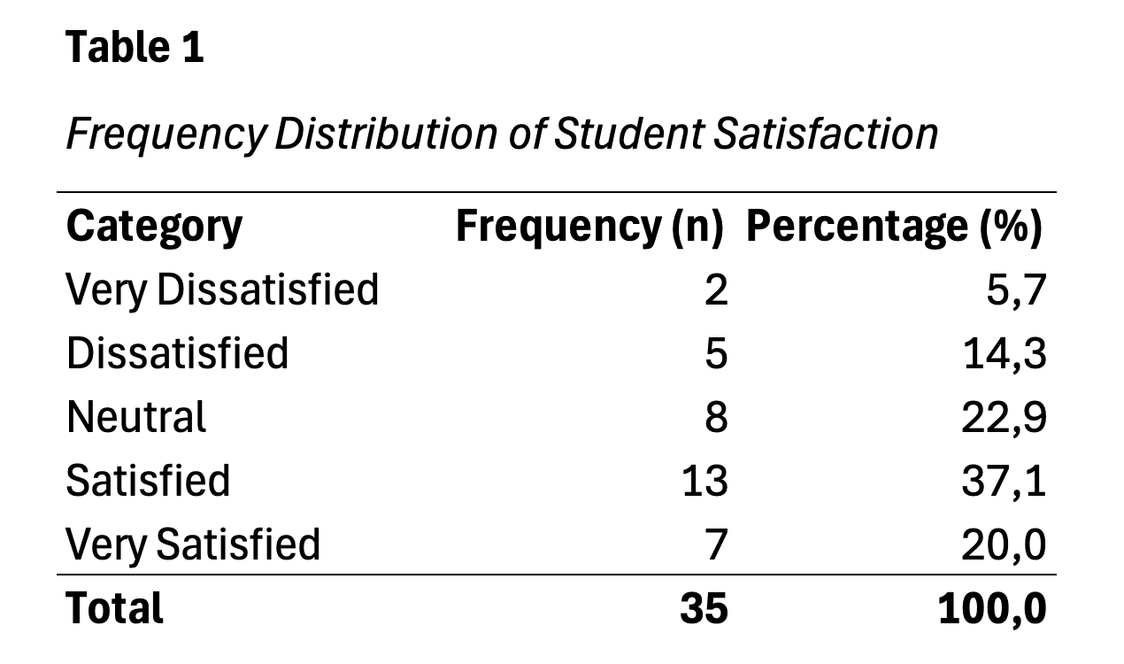
Figure 10: APA 7th edition formatted frequency table showing proper structure with table number, italicized title, column headers, and note
Table 1 Frequency Distribution of Participant Gender
| Category | Frequency (n) | Percentage (%) |
|---|---|---|
| Male | 95 | 38.0 |
| Female | 156 | 62.0 |
| Total | 251 | 100.0 |
Table 5: Example APA-formatted frequency distribution table
Note. N = 251.
In-Text Reporting of Frequency Tables
When referencing frequency tables in your Results narrative, follow these patterns:
First reference to a table:
The majority of participants were female (n = 156, 62%), while 95 (38%) were male (see Table 1).
Subsequent references:
As shown in Table 1, the sample was predominantly female.
Reporting multiple categories:
Educational attainment varied across the sample (see Table 2). The largest group held bachelor's degrees (n = 89, 35.5%), followed by master's degrees (n = 72, 28.7%), some college (n = 45, 17.9%), high school diplomas (n = 32, 12.7%), and doctoral degrees (n = 13, 5.2%).
Formatting Guidelines
Decimal places: Use one decimal place for percentages (62.0%, not 62% or 62.03%)
Alignment: Right-align numbers for easier reading
Bold totals: Bold the Total row to distinguish it from category rows
Capitalization: Capitalize category labels following standard title case rules
Table borders: APA 7th edition allows minimal borders (top, bottom, and under headers)
Reporting Missing Data in Frequency Tables
When you have missing data, transparency is essential:
Option 1: Include "Not Reported" category
| Category | Frequency (n) | Percentage (%) |
|---|---|---|
| Male | 95 | 38.0 |
| Female | 156 | 62.0 |
| Not Reported | 12 | 4.8 |
| Total | 263 | 100.0 |
Table 6: Frequency distribution including missing data as "Not Reported" category
Option 2: Calculate percentages based on valid responses
| Category | Frequency (n) | Percentage (%) |
|---|---|---|
| Male | 95 | 38.0 |
| Female | 156 | 62.0 |
| Total | 251 | 100.0 |
Table 7: Frequency distribution with percentages based on valid responses only
Note. Percentages calculated based on valid responses (n = 251). Missing data: n = 12 (4.6% of total sample).
Choose the approach that best fits your research context. Demographic variables often use Option 1 to show the extent of missing data, while Likert scales typically use Option 2 with missing data noted.
Common Scenarios and Solutions
This section addresses specific situations you're likely to encounter when creating frequency tables for thesis research.
Scenario 1: Likert Scale Frequency Tables
Situation: You have a 7-point Likert scale (1 = Strongly Disagree to 7 = Strongly Agree) with 250 responses. Some respondents skipped the item.
Solution:
Use COUNTIF for each response value (1-7), calculate percentages based on valid responses, and report missing data in a note.
Response 1: =COUNTIF($B$2:$B$251,1)
Response 2: =COUNTIF($B$2:$B$251,2)
...
Response 7: =COUNTIF($B$2:$B$251,7)
Valid n: =SUM(E2:E8)
Percentage: =E2/$E$9*100
Report in APA format:
| Response | Frequency (n) | Percentage (%) |
|---|---|---|
| 1 - Strongly Disagree | 8 | 3.3 |
| 2 | 15 | 6.1 |
| 3 | 32 | 13.1 |
| 4 - Neutral | 58 | 23.7 |
| 5 | 67 | 27.5 |
| 6 | 48 | 19.7 |
| 7 - Strongly Agree | 16 | 6.6 |
| Total | 244 | 100.0 |
Table 8: Frequency distribution of 7-point Likert scale responses
Note. Percentages based on valid responses (n = 244). Missing data: n = 6 (2.4%).
Scenario 2: Multiple Demographic Variables
Situation: You need frequency tables for gender, age group, education, and ethnicity.
Solution:
Create a Pivot Table, then drag each demographic variable to Rows one at a time, copying the results to a new sheet before switching to the next variable. This is faster than creating four separate COUNTIF tables.
Alternatively, use the Analyze → Fields, Items, & Sets → Insert Slicer feature in Pivot Tables to create interactive filters that let you view frequency distributions for different variables without rebuilding the table.
Scenario 3: Collapsing Categories with Small Frequencies
Situation: Your education variable has 8 categories, but three categories (Certificate, Professional Degree, Other) each have fewer than 5 respondents.
Solution:
Combine small categories into an "Other" category to avoid reporting categories with very small frequencies, which can compromise anonymity and complicate statistical analysis.
Before collapsing:
| Education | n | % |
|---|---|---|
| High School | 23 | 9.2 |
| Some College | 31 | 12.4 |
| Associate's | 18 | 7.2 |
| Bachelor's | 89 | 35.6 |
| Master's | 72 | 28.8 |
| Doctorate | 12 | 4.8 |
| Certificate | 3 | 1.2 |
| Professional | 2 | 0.8 |
| Total | 250 | 100.0 |
Table 9: Education level frequency distribution before collapsing categories
After collapsing:
| Education | n | % |
|---|---|---|
| High School | 23 | 9.2 |
| Some College | 31 | 12.4 |
| Associate's | 18 | 7.2 |
| Bachelor's | 89 | 35.6 |
| Master's | 72 | 28.8 |
| Doctorate | 12 | 4.8 |
| Other | 5 | 2.0 |
| Total | 250 | 100.0 |
Table 10: Education level frequency distribution after collapsing small categories
Document this decision in your Methods section: "Education categories with fewer than five respondents (Certificate, Professional Degree, Other) were combined into a single 'Other' category for analysis."
Scenario 4: Verifying Frequency Table Accuracy
Situation: You want to ensure your frequency table is correct before including it in your thesis.
Solution:
Run these verification checks:
1. Check total n: Sum of all frequencies should equal your total sample size (or valid sample size if you excluded missing data)
2. Check percentages sum to 100%: Allow for minor rounding differences (99.9% or 100.1% due to rounding is acceptable)
3. Spot check individual frequencies: Manually count 2-3 categories to verify COUNTIF formulas are working correctly
4. Cross-reference with descriptive statistics: If you ran descriptive statistics, the n for that variable should match your frequency table total
5. Check for impossible values: If your Likert scale is 1-5 but you see a frequency for 6, there's a data entry error
Troubleshooting Common Frequency Table Errors
COUNTIF Returns Zero for All Categories
Cause: Data type mismatch. Your data contains numbers but you're counting text criteria ("1"), or vice versa.
Solution:
Check if your data is stored as text or numbers. Select a cell and look at the formula bar. If you see '1 (with apostrophe), it's text.
To fix: Use =COUNTIF(range,1) for numeric data or =COUNTIF(range,"1") for text data. Match your criteria to your data type.
Percentages Don't Sum to 100%
Cause 1: Rounding. Each percentage rounds independently, causing cumulative rounding error.
Cause 2: Formula error in percentage calculation or missing a category.
Solution:
For rounding, this is acceptable if the sum is 99.9% to 100.1%. Report percentages to one decimal place.
For formula errors, verify your percentage formula divides by the total of all frequencies: =frequency/SUM($all_frequencies$)*100
Check that you've included all possible response categories. A missing category means those responses aren't counted, causing percentages to fall short of 100%.
Pivot Table Shows Blank or (blank) Rows
Cause: Your source data contains blank cells that Pivot Table is treating as a category.
Solution:
Option 1: Right-click the (blank) row in your Pivot Table and select Remove Item to hide it.
Option 2: Clean your source data by filling blank cells with "Not Reported" or removing incomplete rows, then refresh the Pivot Table.
Option 3: Use Pivot Table filters to exclude blanks: Click the row labels dropdown → uncheck (blank).
FREQUENCY Function Returns #NUM! Error
Cause: Bins are not in ascending order.
Solution:
The FREQUENCY function requires bins to be sorted from smallest to largest. Check your bin array (F2:F6 in the earlier example) and ensure values increase: 25, 35, 45, 55, 65, not 65, 55, 45, 35, 25.
Sort your bin values in ascending order, then re-enter the FREQUENCY array formula.
Cross-Tabulation Shows Unexpected Patterns
Cause: Data entry errors, where respondents were coded incorrectly for one or both variables.
Solution:
Review your raw data for impossible combinations. For example, if your crosstab shows "Male" respondents selecting "Pregnant" in a health status variable, you have a data entry error.
Use Excel's Data Validation and conditional formatting to highlight potential errors in your source data before creating frequency tables.
Choosing the Right Method: Decision Framework
Use this decision flowchart to quickly identify the best frequency table method for your specific thesis data scenario.

Figure 11: Decision flowchart for selecting the appropriate frequency table method based on your data type and analysis needs
Select your frequency table method based on these criteria:
Use COUNTIF When:
- You have a single categorical variable with fewer than 10 categories
- You need a simple frequency table for a Likert scale item
- Your dataset is small to medium (fewer than 500 responses)
- You want full control over table layout and formatting
- You're comfortable writing Excel formulas
Use Pivot Tables When:
- You have multiple variables to analyze
- Your dataset is large (hundreds to thousands of responses)
- You need cross-tabulation of two variables
- You want to explore data interactively before deciding what to report
- You prefer point-and-click over formulas
- Your data might change and you'll need to update tables
Use FREQUENCY Function When:
- You have continuous data to group into bins (age, income, test scores)
- You need a true grouped frequency distribution
- You're comfortable with array formulas
- You need the precision of specified bin boundaries
Use Data Analysis Toolpak When:
- You need both a frequency table and histogram chart simultaneously
- Your thesis advisor specifically requires Toolpak output
- You want quick visual inspection of data distribution
- You're working independently (file won't be shared to computers without the add-in)
Use Manual Pivot Table Grouping When:
- You have continuous data but prefer Pivot Tables over FREQUENCY function
- You want to experiment with different grouping intervals
- You need the flexibility to adjust groups after seeing initial results
For most thesis research with survey data, Pivot Tables offer the best combination of power, flexibility, and ease of use. Start with Pivot Tables for exploratory analysis, then create polished COUNTIF tables for specific variables you'll report in Chapter 4.
Frequently Asked Questions
Next Steps for Your Survey Analysis
You now have comprehensive tools to create professional frequency tables for any categorical data in your thesis research. Frequency tables form the foundation of descriptive statistics in Chapter 4, providing your committee with clear evidence of sample characteristics and response distributions.
After creating frequency tables, your next analytical steps typically include calculating measures of central tendency and variability for continuous variables, examining relationships between variables through correlation or cross-tabulation, and conducting appropriate hypothesis tests based on your research questions.
For comprehensive guidance on the complete survey analysis workflow, see How to Analyze Survey Data in Excel. To learn proper APA formatting for all descriptive statistics results, consult How to Report Descriptive Statistics in APA Format. If you encounter incomplete responses while building frequency tables, review How to Handle Missing Data in Excel Survey Analysis for appropriate treatment strategies.