Descriptive statistics in Excel provides a powerful yet accessible way to summarize and understand your data. Whether you're analyzing sales figures, survey responses, or experimental results, Excel's built-in functions and Analysis ToolPak make it easy to calculate key statistics like mean, median, mode, standard deviation, and variance.
In this comprehensive guide, you'll learn two methods to calculate descriptive statistics in Excel: using individual formulas (AVERAGE, MEDIAN, MODE, STDEV, VAR) and the faster Analysis ToolPak approach. We'll also cover how to visualize your results using histograms, box plots, and scatter plots.
By the end of this tutorial, you'll know how to interpret each statistic and choose the right method for your specific needs. Download the practice dataset from the Download section in the sidebar to follow along step-by-step.
Method 1: Descriptive Analysis in Excel using Functions
Excel provides several built-in functions that calculate summary statistics directly in cells. These functions are:
- AVERAGE function calculates the arithmetic mean of values
- MEDIAN function calculates the middle value when data is ordered
- MODE function calculates the most frequently occurring value
- STDEV function calculates the standard deviation
- VAR function calculates the variance
- MAX and MIN functions calculate the range
First, input your data into an Excel worksheet, with categories in one column and values in another as shown in the example below:
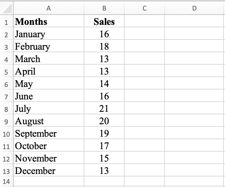
Figure 1: Sample dataset with monthly sales figures for descriptive analysis
If you want to follow along, download the Excel practice file from the Download section in the sidebar.
Next, let's calculate the mean, median, mode, range, standard deviation, and variance in Excel using formulas.
Step 1: Calculate Mean
In cell D2, type =AVERAGE(B2:B13) and hit the ENTER key. This formula calculates the average (arithmetic mean) sales figures for each month. The mean for our dataset is 16.25.
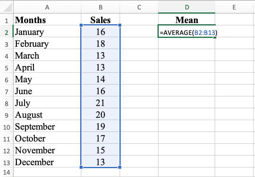
Figure 2: Using the AVERAGE function to calculate mean in Excel
The mean of 16.25 represents the average sales figure for the 12 months. If you add all sales figures and divide by 12, you get 16.25. This value provides a general idea of the typical sales figure for the year.
The mean can be influenced by outliers and extreme values, so it may not always accurately represent typical values. However, in this case, the mean of 16.25 is relatively close to the median of 16, indicating the data is not significantly skewed by outliers.
Step 2: Calculate Median
In cell E2, type =MEDIAN(B2:B13) and press ENTER. This formula calculates the median, the middle value of the data set when values are arranged in order. The median for this dataset is 16.
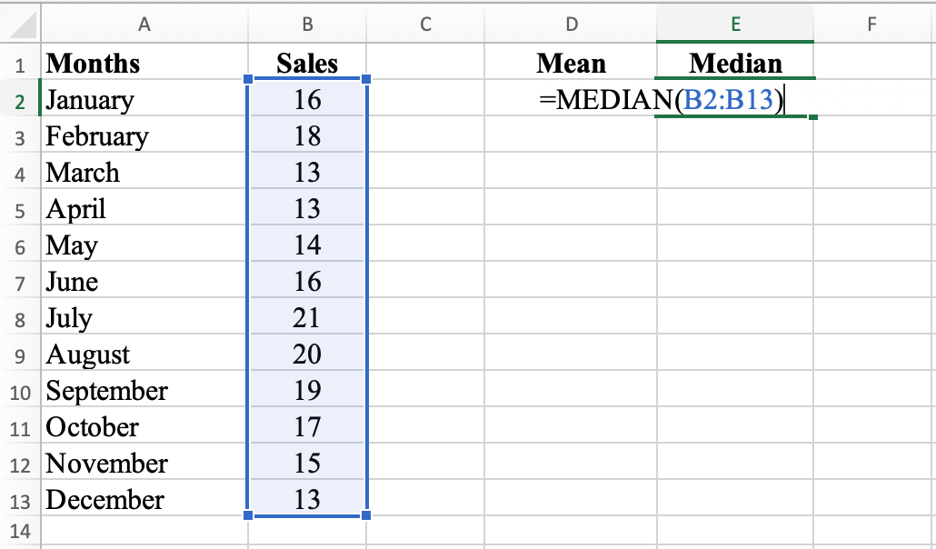
Figure 3: MEDIAN function calculates the middle value of the dataset
The median of 16 indicates the middle value of the sales figures for the 12 months. If you order all sales figures from smallest to largest, the median is the value exactly in the middle. With an even number of data points, the median is the average of the two middle values.
The median is a robust measure of central tendency, which means it's not greatly affected by outliers or extreme values. For this reason, the median is often used as an alternative to the mean when data is not normally distributed.
In this case, the median of 16 provides a good indication of the typical sales figure, as half the sales figures are above 16 and half are below 16.
Step 3: Calculate Mode
In cell F2, type =MODE(B2:B13). This formula calculates the mode, the most frequently occurring value in the data set. The mode for this dataset is 13.
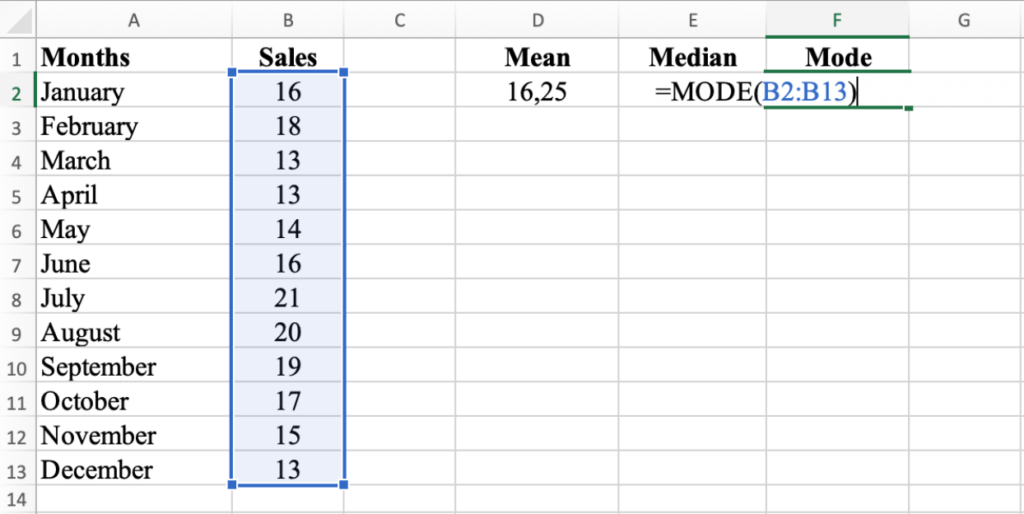
Figure 4: MODE function identifies the most frequently occurring value
The mode of 13 indicates the most frequently occurring sales figure for the 12 months. The mode is the value that appears most frequently in the data.
Unlike the mean and median, the mode can be influenced by the frequency of data points. If several sales figures occur more frequently than others, there may be multiple modes.
In this dataset, the mode of 13 indicates that 13 was the sales figure achieved the most times during the year.
Step 4: Calculate Range
In cell G2, type =MAX(B2:B13) - MIN(B2:B13). This formula calculates the range, the difference between the largest and smallest values in the data set. The range for this dataset is 8.
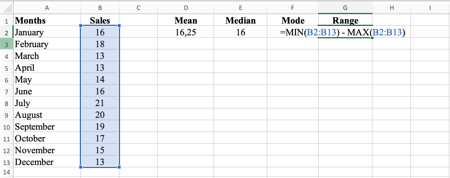
Figure 5: Calculate range by subtracting MIN from MAX
The range of 8 indicates the difference between the highest and lowest sales figures for the 12 months. The range is calculated by subtracting the lowest value from the highest value.
The range provides a rough idea of how spread out the sales figures are and indicates data variability. A larger range means more spread out values, while a smaller range means more clustered values.
In this case, the range of 8 means the highest sales figure was 21 and the lowest was 13.
Step 5: Calculate Standard Deviation
In cell H2, type =STDEV(B2:B13) and hit ENTER. This formula calculates the standard deviation, which measures the spread of the data set. The standard deviation for this dataset is 2.8.
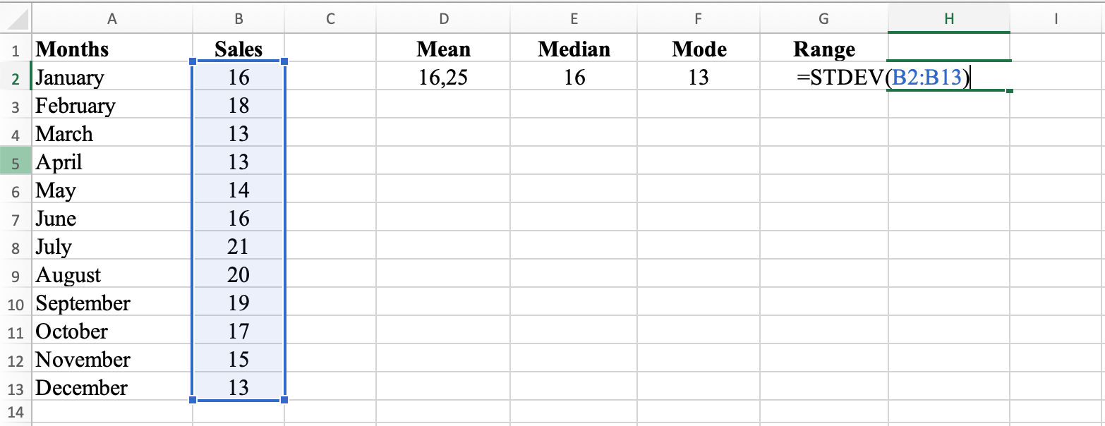
Figure 6: STDEV function measures data spread around the mean
The standard deviation of 2.8 indicates how much the sales figures for the 12 months deviate from the mean. Standard deviation measures how spread out the data is.
Standard deviation is calculated as the square root of the variance, which is the average of the squared differences between each data point and the mean. A larger standard deviation indicates more spread out data, while a smaller standard deviation indicates data points are close to the mean.
In this dataset, the standard deviation of 2.8 indicates that sales figures deviate from the mean by 2.8 on average. Most sales figures are within 2.8 units of the mean.
Step 6: Calculate Variance
In cell I2, type =VAR(B2:B13). This formula calculates the variance, which measures the spread of the squared data set. The variance for this dataset is 7.84.
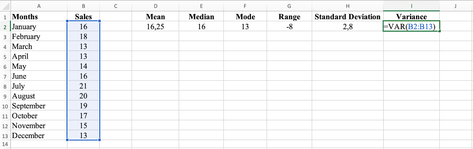
Figure 7: VAR function calculates variance of the dataset
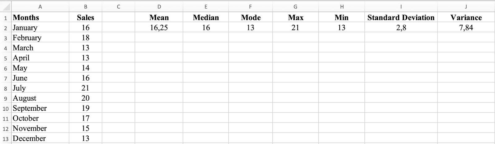
Figure 8: Complete descriptive statistics summary calculated with Excel formulas
The variance of 7.84 indicates how much the sales figures for the 12 months deviate from the mean. Variance measures how spread out the data is.
Variance is calculated as the average of the squared differences between each data point and the mean. A larger variance indicates more spread out data, while a smaller variance indicates data points are close to the mean.
The variance of 7.84 indicates that sales figures deviate from the mean by an average of 7.84 units squared. For easier interpretation, standard deviation (the square root of variance) is often preferred since it's in the same units as your original data. Learn more about the difference between population and sample standard deviation.
Method 2: Descriptive Analysis in Excel using Analysis ToolPak
If you want faster results without manually calculating each statistic, Excel's Data Analysis ToolPak provides a quick way to calculate descriptive statistics.
First, make sure you install the Data Analysis ToolPak in Excel – it takes just a few clicks.
Using the same dataset, navigate to the Data tab, click on the Data Analysis icon and select the Descriptive Statistics option. Select all the Sales values in column B, check the Summary Statistics checkbox and click OK.
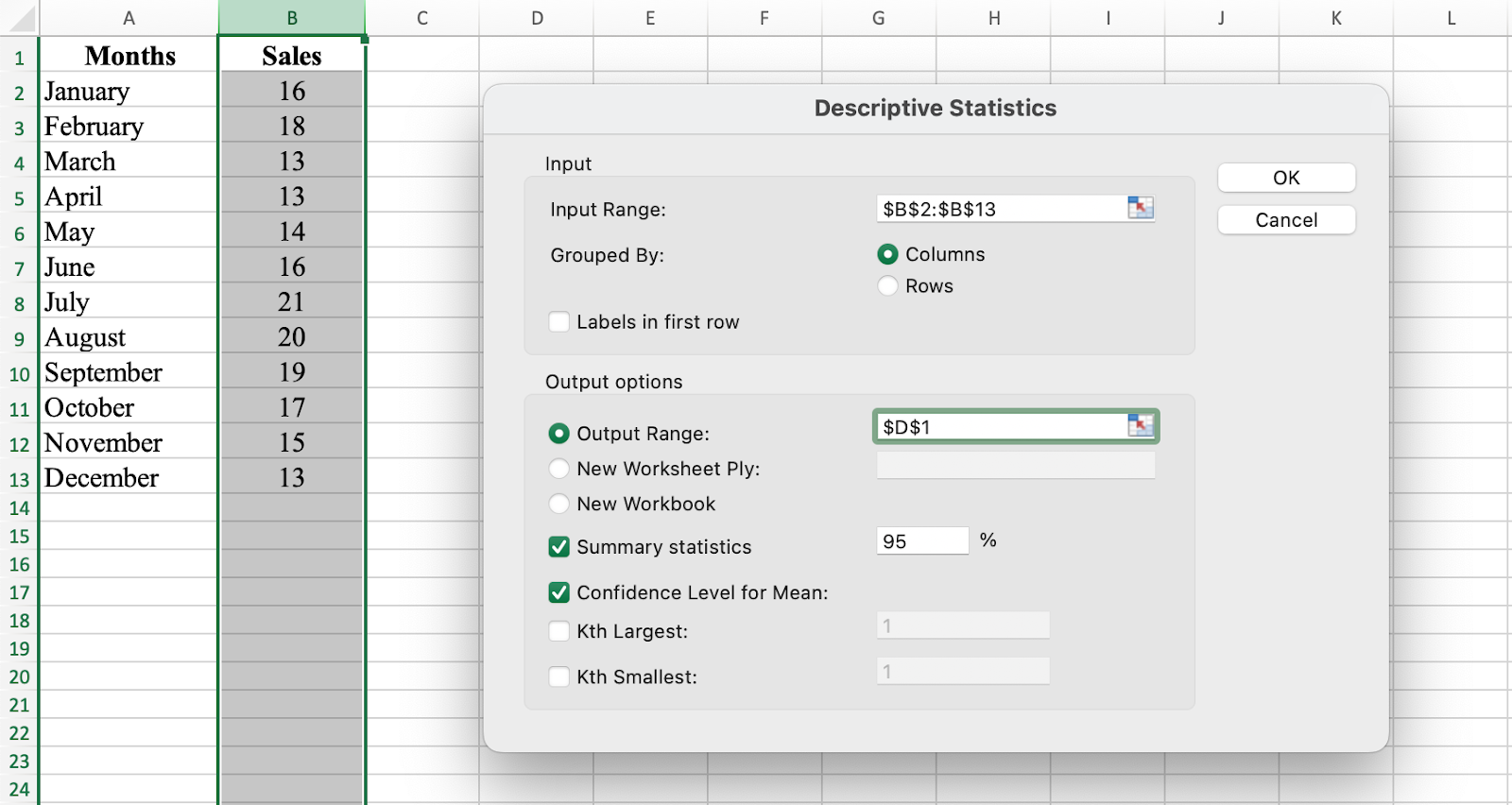
Figure 9: Access Descriptive Statistics through the Data Analysis ToolPak
Excel generates the descriptive statistics for your dataset instantly.
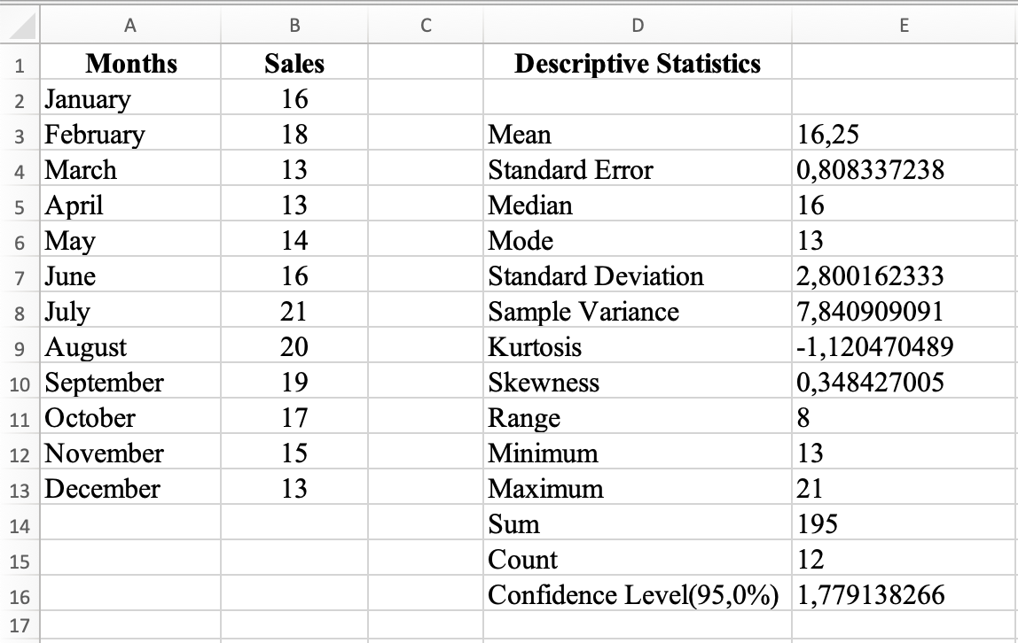
Figure 10: Descriptive statistics results generated by the Analysis ToolPak
Visualizing Descriptive Statistics in Excel
Descriptive statistics are primarily numbers, but visualizations can reveal insights difficult to see in tables alone. Let's create a histogram, box plot, scatter plot, and trend line to visualize our descriptive statistics in Excel.
Step 1: Create a Histogram
A histogram is a bar graph that represents the distribution of a dataset by grouping data into bins and showing the frequency of data points in each bin.
In the Data Analysis window, select Histogram and click OK.
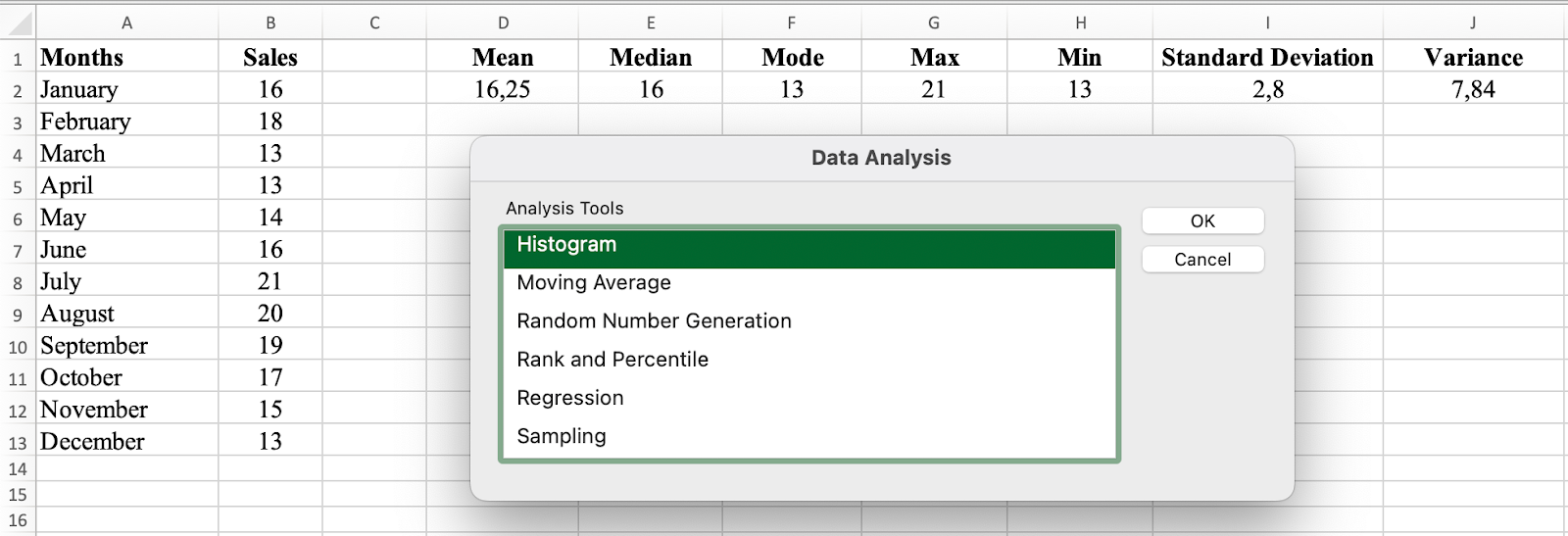
Figure 11: Select Histogram from the Data Analysis menu
Select the Input Range (sales values for January to December) and check the Chart Output checkbox.
NOTE: If you include the column label (i.e., Sales) in your selection, make sure you check the Label box as well.
Click OK.
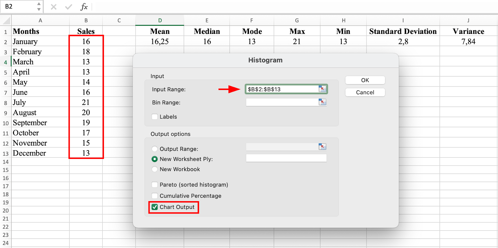
Figure 12: Configure histogram input range and output options
Excel generates a histogram table and chart instantly on a new tab.
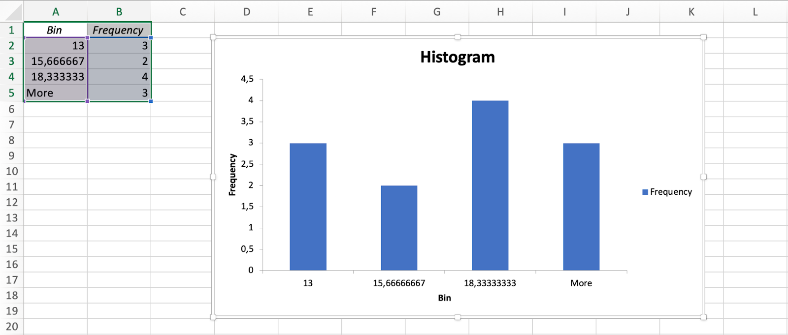
Figure 13: Histogram displaying frequency distribution of sales figures
The height of each bar represents the number of data points in the corresponding bin. The histogram shows the distribution of sales figures for each month, allowing you to quickly see how many sales were made in each range.
For example, if there's a bar representing the sales range of 10 to 15, this means a certain number of sales were made in that specific range.
Step 2: Create a Box Plot
Go to the Insert tab in Excel. In the charts section, click on the Statistical icon and select Box and Whisker chart type.
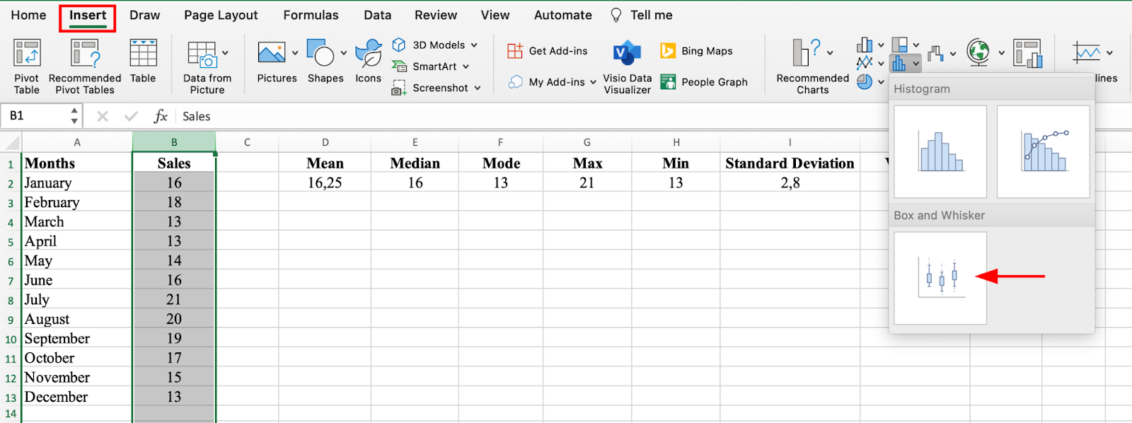
Figure 14: Insert a Box and Whisker plot from Statistical charts
The Box and Whisker plot shows the distribution of sales figures for each month. The box represents the interquartile range (IQR), which is the range of the middle 50% of the data. The median is represented by a line within the box.
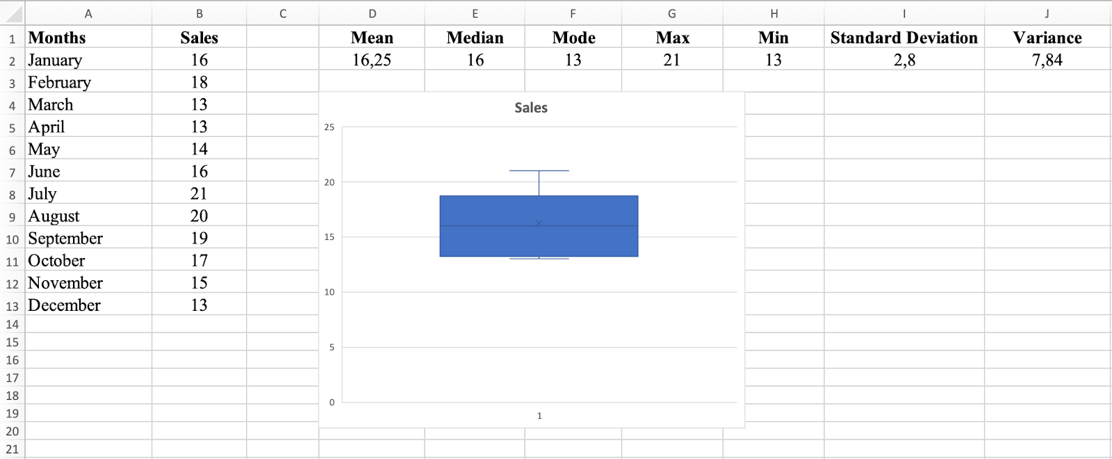
Figure 15: Box and Whisker plot showing data distribution and quartiles
The whiskers represent the minimum and maximum values, excluding outliers. Any data points outside the whiskers are considered outliers and shown as individual dots.
In this dataset, the Box and Whisker plot shows that the median sales figure is 16, and the IQR is 7 (13 to 18). This means 50% of sales figures fall between 13 and 18. There are no outliers visible, indicating all sales figures are relatively close to the median.
Step 3: Create a Scatter Plot
A scatter plot graphs individual data points and shows the relationship between two variables. In this dataset, the scatter plot shows the relationship between months and sales figures, revealing whether there's a positive or negative relationship and its strength.
Select both columns of data, go to the Insert tab, and choose the Scatter chart type to visualize the relationship between months and sales.
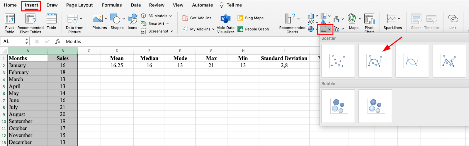
Figure 16: Select Scatter chart to visualize relationships between variables
In this dataset, the scatter plot shows a weak positive relationship between months and sales figures. As months progress, sales figures tend to increase slightly, but the relationship is not strong.
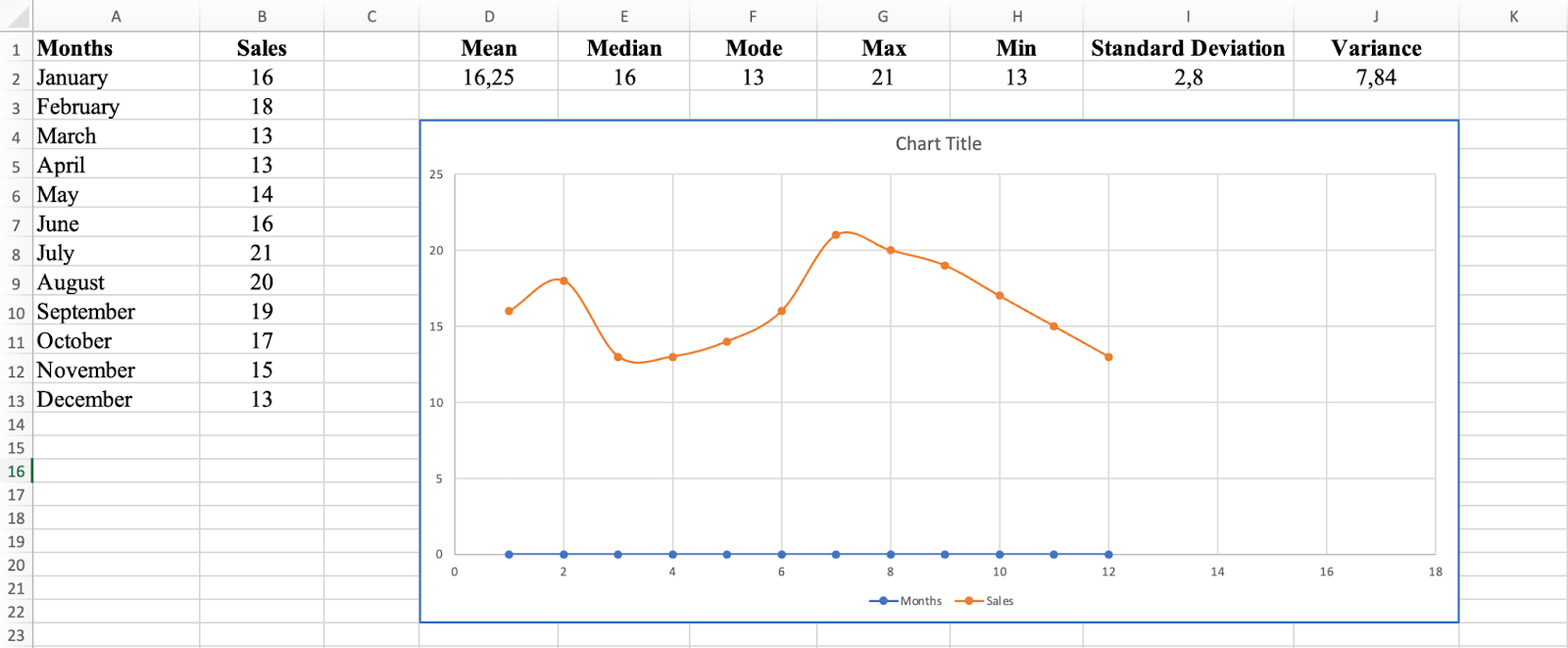
Figure 17: Scatter plot revealing the relationship between months and sales
Step 4: Add a Trend Line
The trend line provides an estimate of future sales figures. If the trend line is upward-sloping, sales are generally increasing and future sales should be higher. If downward-sloping, sales are decreasing and future sales should be lower.
Right-click on a data point in the scatter plot, select Add Trendline, and choose the type of trendline that best fits the data to identify patterns.
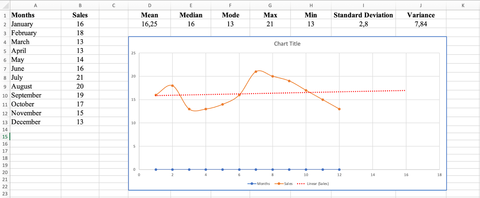
Figure 18: Add a trendline to identify patterns in your data
In this sales dataset, the trend line is relatively flat, indicating no significant upward or downward trend in sales figures. You can expect sales figures to remain relatively stable in the future.
Frequently Asked Questions
Wrapping Up
Calculating descriptive statistics in Excel is a valuable tool for gaining insights into your data. Whether you choose the manual formula approach or the faster Analysis ToolPak method, Excel provides powerful functions to calculate mean, median, mode, standard deviation, variance, and range.
By visualizing your descriptive statistics with histograms, box plots, and scatter plots, you can identify patterns, outliers, and trends that might not be apparent from numbers alone. These techniques form the foundation of data analysis and help you make informed decisions based on your data.
Practice with the sample dataset provided, and soon you'll be confidently analyzing your own data in Excel.