I have reviewed hundreds of thesis datasets over the years, and the same mistakes appear repeatedly. Students spend weeks collecting survey data, only to compromise their results with preventable Excel errors.
These mistakes fall into four critical stages: pre-analysis setup, data cleaning, statistical analysis, and results presentation. A single error in any stage can invalidate your entire analysis.
This guide shows you the 10 most common mistakes students make when analyzing survey data in Excel and how to fix them before submitting your thesis.
Pre-Analysis Setup Mistakes
These mistakes happen before you run a single statistical test. Catching them early saves hours of rework.
Mistake #1: Not Installing Analysis ToolPak First
The Problem:
You open Excel, ready to run a t-test or ANOVA, and discover there is no statistical analysis option in the Data tab. You search through every menu, finding nothing.
Excel does not include statistical tests by default. The Analysis ToolPak add-in must be installed manually.
How to Fix:
For complete installation instructions (Windows and Mac), see our guide: How to Add Data Analysis in Excel.
Quick steps for Windows:
- Click File in the top-left corner
- Select Options at the bottom of the menu
- Click Add-ins in the left sidebar
- At the bottom, find "Manage:" dropdown, select Excel Add-ins, click Go
- Check the box next to Analysis ToolPak
- Click OK
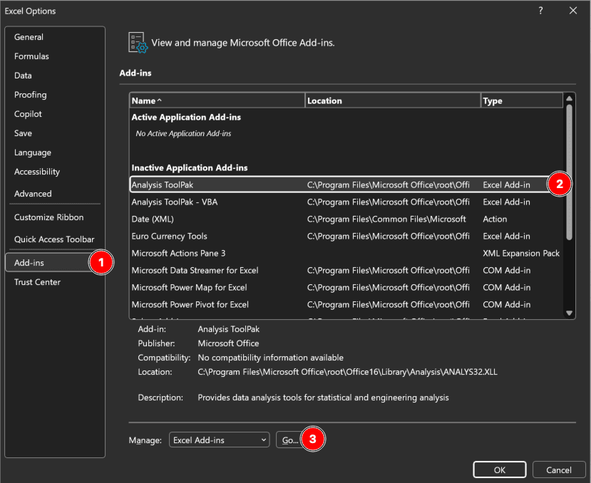 Figure 1: Excel Add-ins dialog with Analysis ToolPak enabled (Windows)
Mac users: Go to Tools → Excel Add-ins instead of File → Options.
After installation, the Data Analysis button appears in the Data tab (far right). This button gives you access to t-tests, ANOVA, regression, correlation, and descriptive statistics.
Prevention:
Install Analysis ToolPak the first time you open Excel for your thesis. Add it to your research setup checklist before collecting any data.
Mistake #2: Mixing Text and Numbers in Response Columns
The Problem:
Your survey responses contain text like "Strongly Agree," "Agree," "Neutral," "Disagree," and "Strongly Disagree." When you try to calculate the average satisfaction score, Excel returns an error or zero.
Text cannot be used in statistical formulas. Excel functions like AVERAGE, STDEV, and CORREL require numerical input.
How to Fix:
Code all responses numerically before analysis. Create a legend in a separate sheet:
| Numerical Code | Text Label |
|---|---|
| 1 | Strongly Disagree |
| 2 | Disagree |
| 3 | Neutral |
| 4 | Agree |
| 5 | Strongly Agree |
Table 1: Numerical coding for 5-point Likert scale responses
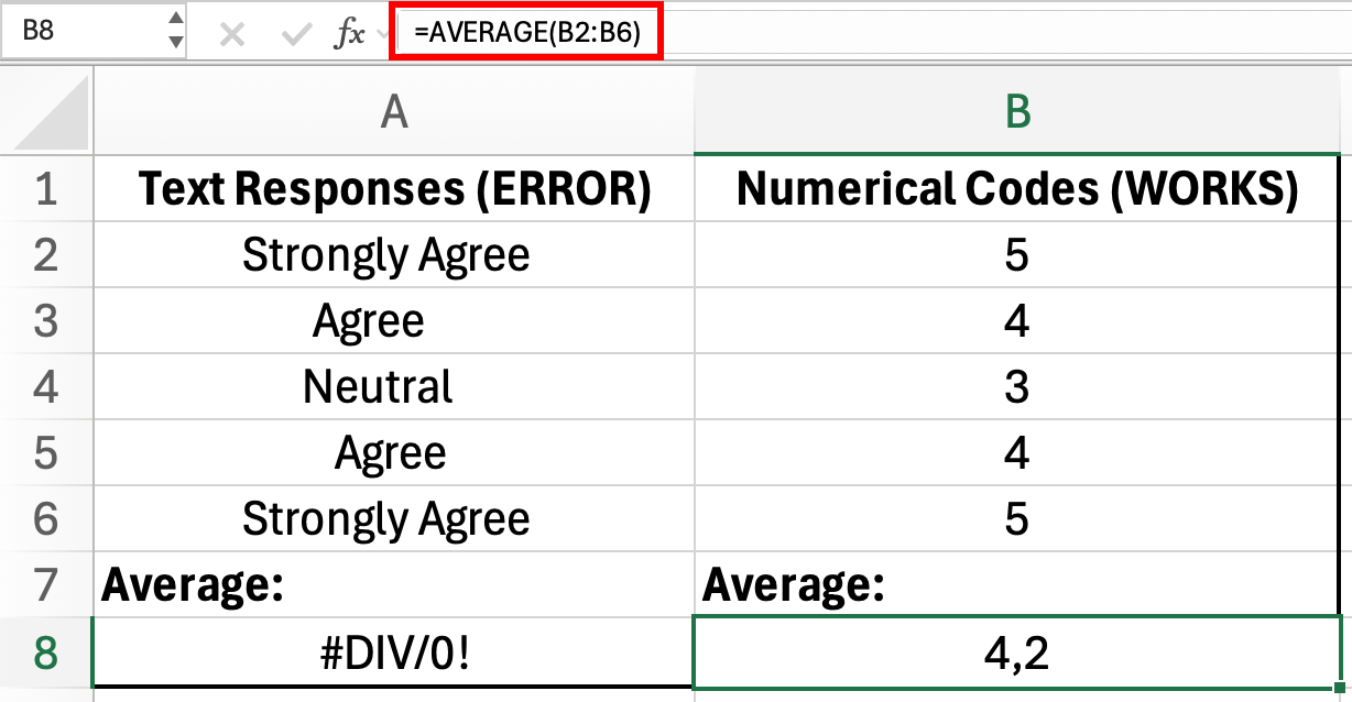 Figure 2: Text responses cannot be used in AVERAGE formula (error in A8), but numerical codes work correctly (4.2 in B8)
When exporting from survey tools (Google Forms, Qualtrics, SurveyMonkey), select the option for numerical values instead of text labels.
If you already have text responses:
- Create a new column
- Use =IF or =VLOOKUP to convert text to numbers
- Delete the original text column after verification
Prevention:
Configure your survey export settings to output numerical codes from the start. Most platforms have a "Export as numerical values (1-n)" option.
Mistake #3: Inconsistent Data Entry
The Problem:
You manually entered survey responses and used inconsistent formats. Some respondents are coded as "Male", others as "M", and a few as "Man". When you create a Pivot Table to summarize responses by gender, Excel shows three separate categories instead of one.
This problem also appears with spelling variations: "Strongly Agree" vs "StronglyAgree" vs "Strongly Agree" (extra space). Each variation becomes a separate category in your analysis.
Note: Pivot Tables and COUNTIF are case-insensitive, so "M" and "m" would be counted together. However, different spellings like "Male", "M", and "Man" are always treated as separate values.
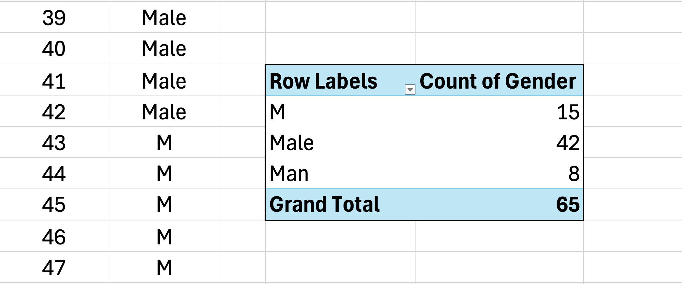 Figure 3: Pivot Table treats "Male", "M", and "Man" as three separate categories due to inconsistent data entry
Your frequency counts are now split across multiple rows, making it impossible to report accurate totals without manual consolidation.
How to Fix:
Use Data Validation to restrict entries before data collection:
- Select the column where responses will be entered
- Go to Data tab
- Click Data Validation
- Under "Allow:", select List
- In "Source:", type your allowed values:
Male,Female,Other(separated by commas) - Click OK
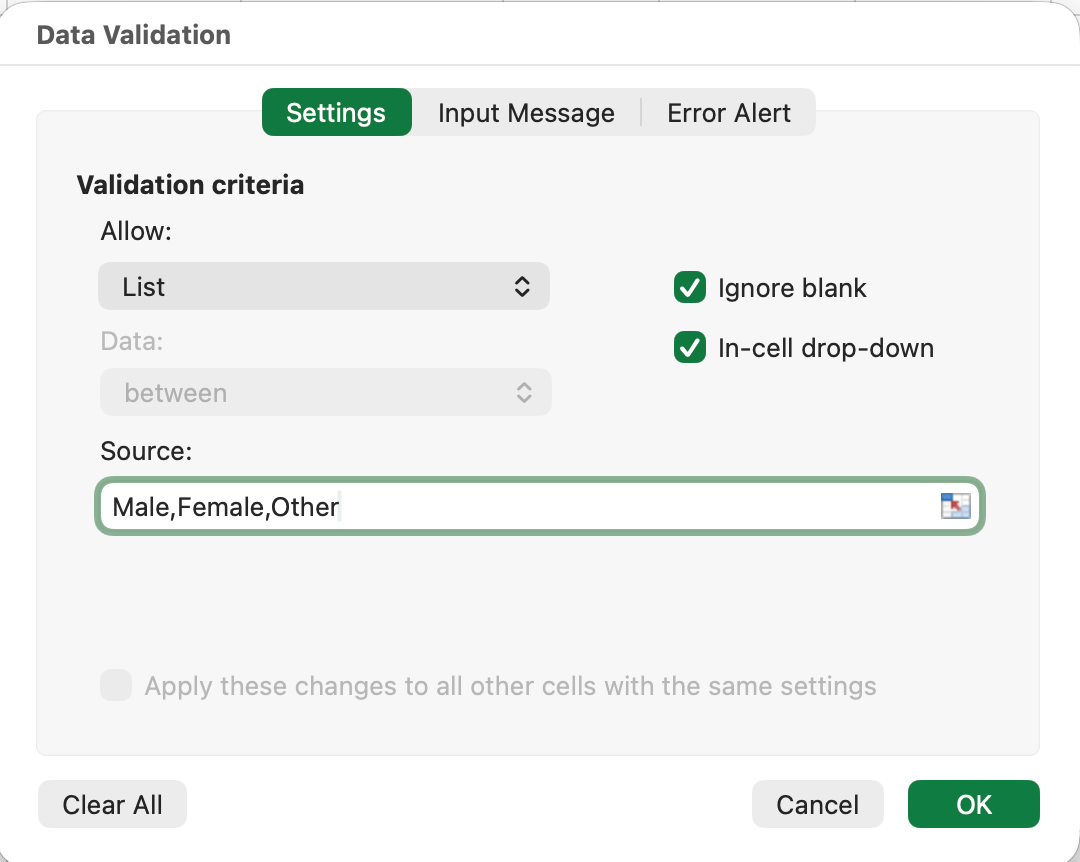 Figure 4: Data Validation setup to restrict entries to predefined list values
Now, users can only select from the dropdown list. Typing is disabled, eliminating inconsistencies.
If data is already entered inconsistently:
- Use Find & Replace (Ctrl+H) to standardize
- Find "M" → Replace with "Male" (with "Match entire cell contents" checked)
- Find "Man" → Replace with "Male"
- Repeat for all variations
Prevention:
Set up Data Validation before collecting any data. For online surveys, this happens automatically through your survey platform.
Data Cleaning Mistakes
Raw survey data is rarely analysis-ready. These mistakes occur when students skip the cleaning phase.
Mistake #4: Ignoring Missing Data
The Problem:
Some respondents skipped questions, leaving blank cells in your dataset. You run AVERAGE on a column and get 4.2. Your advisor asks: "How did you handle missing data?" You realize you never documented your approach.
Excel's AVERAGE function automatically excludes blank cells from both the sum and the count. This behavior may or may not match your intended methodology:
- What Excel does: (sum of 80 non-blank values) / 80 = 4.2
- Alternative approach: Treat missing as zero: (sum of 80 values) / 100 = 3.36
- Another approach: Impute with median: (sum of 80 values + 20 × median) / 100
The issue is not that Excel is "wrong." It is that you have made a methodology decision without realizing it. If you do not document how missing data was handled, reviewers will question your results.
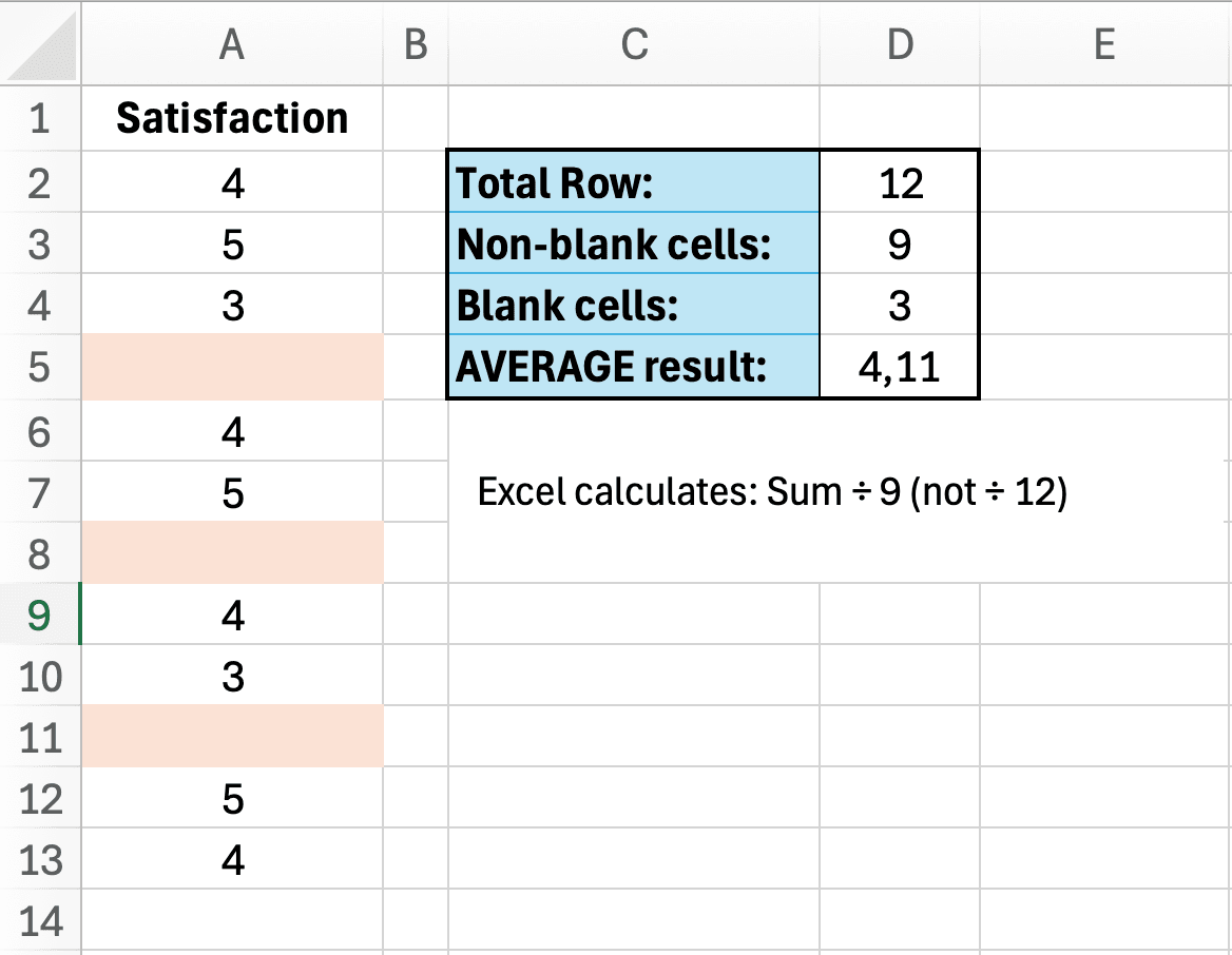 Figure 5: Excel's AVERAGE function excludes blank cells, which may or may not match your intended methodology
How to Fix:
First, identify how much data is missing:
=COUNTA(B2:B101)  // Counts non-empty cells
=ROWS(B2:B101)    // Total rows (should be 100)
=ROWS(B2:B101)-COUNTA(B2:B101)  // Missing data count
Then, choose a strategy:
Strategy 1: Delete the entire row (if data is missing completely at random)
- Select rows with missing values
- Right-click → Delete
- Update your sample size (n=80 instead of n=100)
Strategy 2: Replace with median (for numerical data)
- Calculate median: =MEDIAN(B2:B101)
- Fill blank cells with this value
- Note in your methodology: "Missing values replaced with median"
Strategy 3: Code as "Missing" (for categorical data)
- Replace blanks with 99 or "Missing"
- Exclude from statistical calculations
- Report separately: "85 valid responses, 15 missing"
Prevention:
Make all survey questions required (unless ethically inappropriate). If missing data is unavoidable, plan your handling strategy before analysis.
Important note for your thesis:
Document your missing data strategy in your methodology section. Write: "Missing values (n=15, 15%) were [deleted/replaced with median/coded separately] because [justification]."
Reviewers will question undocumented missing data handling.
Mistake #5: Not Checking for Duplicate Responses
The Problem:
A respondent accidentally submitted your survey twice. Another used two different email addresses. Your sample size is inflated, and some responses are weighted twice in your analysis.
How to Fix:
 Figure 6: Remove Duplicates dialog with Email selected to find duplicate survey submissions
- Select your entire dataset (Ctrl+A)
- Go to Data tab
- Click Remove Duplicates button
- Choose columns to check (typically Timestamp or Email)
- Click OK
Excel shows how many duplicates were found and removed. Update your sample size accordingly.
For online surveys, check your platform settings:
- Google Forms: Limit to 1 response per email
- Qualtrics: Enable "Prevent Ballot Box Stuffing"
- SurveyMonkey: Require respondent email
Prevention:
Enable duplicate prevention in your survey settings. For paper surveys, assign each respondent a unique ID and check for duplicate IDs before analysis.
Calculate Your Sample Size
Use our free calculator to determine your required sample size using Yamane, Cochran, and Krejcie & Morgan. Compare all three methods and get an APA-ready citation for your thesis.
Try CalculatorStatistical Analysis Mistakes
These mistakes happen during the actual analysis and often lead to incorrect conclusions.
Mistake #6: Using the Wrong Statistical Test
The Problem:
You want to compare satisfaction scores across three departments (Marketing, Sales, Operations). You run three separate t-tests:
- Marketing vs. Sales (p=0.04)
- Marketing vs. Operations (p=0.06)
- Sales vs. Operations (p=0.03)
This approach is wrong. Multiple t-tests inflate your Type I error rate (false positives). With three comparisons, your actual error rate is not 5% but approximately 14%.
How to Fix:
Use the appropriate test for your research question:
| Research Question | Number of Groups | Correct Test |
|---|---|---|
| Compare two groups | 2 | Independent t-test |
| Compare three or more groups | 3+ | One-Way ANOVA |
| Test same group twice | 2 (paired) | Paired t-test |
| Relationship between variables | 2 (continuous) | Pearson correlation |
| Compare categorical data | 2+ (categorical) | Chi-square test |
Table 2: Statistical test selection guide for common research questions
For the three-department example, the correct approach is:
- Run one-way ANOVA to test if any groups differ
- If significant (p < 0.05), run post-hoc tests to identify which specific pairs differ
- Report: "One-way ANOVA revealed significant differences, F(2,297)=4.82, p=0.009"
Prevention:
Before collecting data, identify your statistical test. Refer to our T-Test vs ANOVA decision guide for a complete flowchart.
Mistake #7: Calculating Cronbach's Alpha on Reverse-Coded Items
The Problem:
You calculate Cronbach's alpha for a 5-item self-efficacy scale and get α=0.45 (poor reliability). You recheck your data entry and formulas. Everything looks correct.
The issue: Your scale includes negatively worded items that were not reverse-coded.
Example scale:
- "I feel confident in my abilities" (positive)
- "I can handle most challenges" (positive)
- "I often doubt my skills" (negative - needs reversing)
- "I am capable of learning new things" (positive)
- "I do NOT believe in myself" (negative - needs reversing)
When respondents strongly agree with item 3 (score=5), they actually have LOW self-efficacy. This must be reversed to 1 before calculating alpha.
How to Fix:
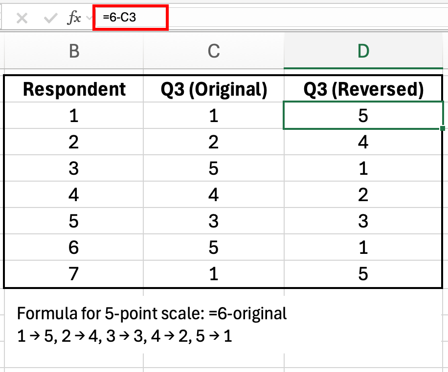 Figure 7: Reverse coding formula for a 5-point scale: =6-original_value
For a 5-point scale (1-5), use this formula:
=6-B2For a 7-point scale (1-7):
=8-B2General formula:
=(MAX_value + MIN_value) - original_valueAfter reversing negatively worded items, recalculate Cronbach's alpha. Your reliability will likely jump from 0.45 to 0.80+.
Prevention:
When designing your survey, mark which items need reverse coding. Before calculating any reliability statistics, create a "Reversed Items" section in your Excel file and apply the formula.
See our guide on interpreting Cronbach's alpha results for troubleshooting other reliability issues.
Mistake #8: Wrong Formula for Percentages
The Problem:
You report: "50 respondents agreed with the statement."
Your thesis reviewer asks: "50 out of how many? What percentage?"
You calculate percentages manually and get confused. Your percentages add up to 94% or 107% instead of 100%. Common errors include:
- Using the wrong denominator: Dividing by total rows (including headers or blank rows) instead of valid responses
- Mixing formulas: Using COUNTA for some rows and COUNT for others
- Forgetting to exclude missing data: Including blank cells in your total count
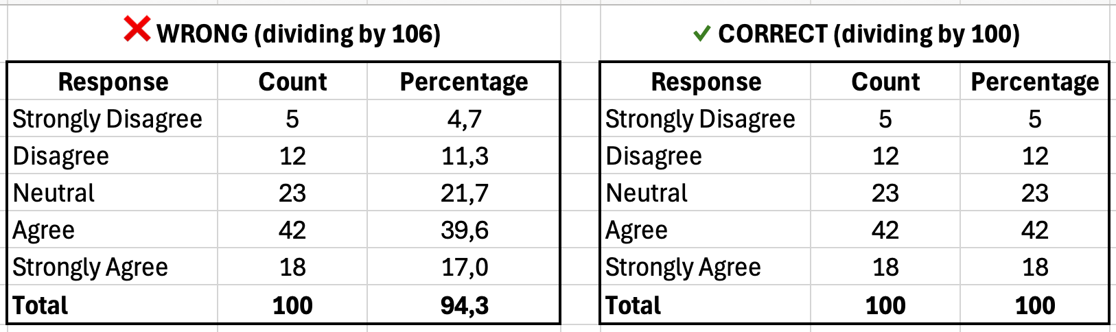 Figure 8: Left shows incorrect percentages (94% total due to wrong denominator); right shows correct calculation (100% total)
How to Fix:
Always report both count and percentage, using consistent formulas:
// Count how many said "Agree" (coded as 4)
=COUNTIF(B2:B101, 4)

// Total respondents
=COUNTA(B2:B101)

// Percentage
=COUNTIF(B2:B101, 4) / COUNTA(B2:B101) * 100
Example frequency table with percentages:
The formula pattern for each row is:
=COUNTIF(B:B, [response_value]) / COUNTA(B:B) * 100Where [response_value] is 1 for "Strongly Disagree", 2 for "Disagree", etc.
| Response | Count | Percentage |
|---|---|---|
| Strongly Disagree | 5 | 5.0% |
| Disagree | 12 | 12.0% |
| Neutral | 23 | 23.0% |
| Agree | 42 | 42.0% |
| Strongly Agree | 18 | 18.0% |
| Total | 100 | 100.0% |
Table 3: Frequency table showing response distribution (percentages must sum to 100%)
Verification check:
Sum all percentages. They must equal 100% (allowing for 0.1% rounding error). If your total is 98% or 103%, you have a formula error.
Prevention:
Create a template with pre-built percentage formulas. Reuse this template for all survey questions.
Results Presentation Mistakes
Your analysis may be correct, but poor presentation undermines credibility.
Mistake #9: Reporting Too Many Decimal Places
The Problem:
You report mean satisfaction as 3.8462857143 (Excel's raw output).
This level of precision is false. A 5-point Likert scale cannot measure satisfaction to 10 decimal places. You are reporting measurement precision your instrument does not have.
How to Fix:
Use the ROUND function:
=ROUND(AVERAGE(B2:B101), 2)This returns 3.85 instead of 3.8462857143.
Recommended decimal places:
| Statistic | Decimal Places | Example |
|---|---|---|
| Mean (M) | 2 | M = 3.85 |
| Standard deviation (SD) | 2 | SD = 0.92 |
| Correlation (r) | 3 | r = 0.547 |
| P-value | 3 | p = 0.003 |
| Effect size (Cohen's d) | 2 | d = 0.65 |
| Percentage | 1 | 42.0% |
Table 4: APA-recommended decimal places for common statistics
Prevention:
Apply ROUND to all calculated statistics before copying them into your thesis. Set Excel's display format to 2 decimal places for your entire results table.
See our guide on reporting descriptive statistics in APA format for complete formatting rules.
Mistake #10: Creating Misleading Charts
The Problem:
You create a bar chart comparing mean satisfaction across three groups:
- Group A: 3.8
- Group B: 3.9
- Group C: 4.0
To make the differences look more impressive, you set the Y-axis minimum to 3.5 instead of 0. The chart now shows Group C's bar as twice the height of Group A's bar, even though the actual difference is only 0.2 points.
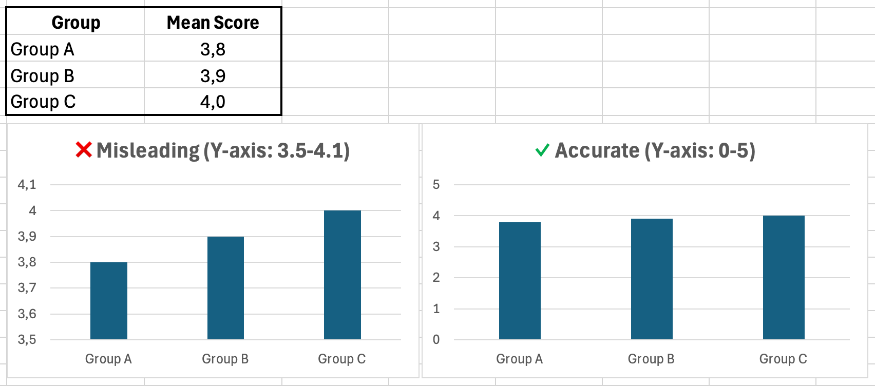 Figure 9: Same data, different Y-axis scales. Left chart exaggerates differences; right chart shows accurate proportions
How to Fix:
Follow these charting rules:
- Always start Y-axis at zero for bar charts (unless there is a strong justification)
- Use 2D charts (avoid 3D pie charts, which distort perception)
- Label axes clearly (include units)
- Use consistent colors (do not randomly assign colors to groups)
- Include error bars for means (standard error or 95% CI)
For Likert scale data (1-5), set Y-axis from 0 to 5, even if all responses fall between 3 and 4.
Prevention:
Use Excel's default chart settings as a starting point. Only adjust axis scales if you can justify the change to your thesis committee.
Calculate Your Sample Size
Use our free calculator to determine your required sample size using Yamane, Cochran, and Krejcie & Morgan. Compare all three methods and get an APA-ready citation for your thesis.
Try CalculatorYour Prevention Checklist
Use this checklist before starting any survey analysis:
Pre-Analysis Setup:
- Analysis ToolPak installed and Data Analysis button visible
- All responses coded numerically (1-5), not text ("Agree")
- Data Validation applied to prevent inconsistent entries
- Survey export settings configured for numerical output
Data Cleaning:
- Missing data strategy decided and documented
- Duplicate responses checked and removed
- Sample size updated after cleaning (n=final count)
- All cells contain valid data (no errors, no text in numerical columns)
Statistical Analysis:
- Correct statistical test identified before analysis
- Negatively worded items reverse-coded before reliability tests
- Assumptions checked (normality, homogeneity of variance)
- Multiple comparisons corrected (if running multiple t-tests, use ANOVA instead)
Results Presentation:
- All statistics rounded to appropriate decimal places
- Percentages verified to sum to 100%
- Charts use zero-based Y-axis (unless justified)
- Sample sizes reported (n=X) in all tables and charts
- Results match APA 7th edition formatting guidelines
Download this checklist and keep it visible while working on your analysis.
Frequently Asked Questions
Next Steps
Now that you know which mistakes to avoid, follow these guides to analyze your survey data correctly:
Start here: How to Analyze Survey Data in Excel: Complete Guide
Choose your statistical test:
Check reliability:
Report results:
References
- American Psychological Association. (2020). Publication Manual of the American Psychological Association (7th ed.). American Psychological Association.
- Field, A. (2018). Discovering Statistics Using IBM SPSS Statistics (5th ed.). SAGE Publications.
- Pallant, J. (2020). SPSS Survival Manual: A Step by Step Guide to Data Analysis Using IBM SPSS (7th ed.). Open University Press.
- Nunnally, J. C., & Bernstein, I. H. (1994). Psychometric Theory (3rd ed.). McGraw-Hill.