Are you ready to take your data analysis skills to the next level with descriptive statistics in R? Then let's get started!
Descriptive statistics are a set of techniques that help us summarize and describe the main features of a dataset. It helps us get a quick and simple understanding of the data, and they are often the first step in any data analysis process.
In this lesson, we're going to dive into the world of descriptive statistics in R. We'll start by preparing our sales dataset and then calculate important descriptive statistics such as the mean, median, and mode, range, standard deviation, and variance. And once we have these statistics, we'll use them to get a better understanding of our data and to start making informed decisions.
But that's not all! We'll also take a look at some basic visualizations in R, such as histograms, box plots, scatter plots, and trend lines. These visualizations will help us get a better understanding of the distribution and relationships within our data.
So, are you ready to learn how to perform descriptive statistics in R? Then let's get started!
Step 1: Prepare Your Dataset
The first step is to prepare your dataset and store it in R as a vector. In this example, we'll be using 12 figures of sales data, each representing the volume of sales for the months January to December:
`**sales <- c(16, 18, 13, 13, 14, 16, 21, 20, 19, 17, 15, 13)**`
Step 2: Calculate the Mean
Our first stop is the mean, which gives us an idea of the average sales figure for the year. To calculate the mean in R, we use the mean() function:
`**mean(sales)**`
The result of our mean calculation is 16.25, which tells us that the average sales figure for the year was 16.25 units.
Step 3: Calculate the Median
Next up, let's calculate the median. The median is the middle value in a set of data, and it can be a better indicator of the typical sales figure if the data is skewed. To calculate the median in R, we use the median() function:
`**median(sales)**`
The result of our median calculation is 16, which tells us that the middle value of the sales figures for the year was 16 units.
Step 4: Calculate the Mode
Another important descriptive statistic is the mode, which is the value that appears most often in a set of data. To calculate the mode in R, we use the table() and which.max() functions:
mode <- table(sales)
mode[which.max(mode)]
The result of our mode calculation is 13, which tells us that the most common sales figure for the year was 13 units.
Step 5: Calculate the Range
We can also calculate the range, which gives us an idea of how spread out the data is. To calculate the range in R, we use the range() function:
`**range(sales)**`
The result of our range calculation is 8, which tells us that the sales figures varied by 8 units between the minimum ("13") and maximum ("21") sales figures for the year.
Step 6: Calculate the Standard Deviation
Next, let's calculate the standard deviation. The standard deviation is a measure of how spread out the data is, and it gives us an idea of how much the sales figures vary from the mean.
To calculate the standard deviation in R, we use the sd() function:
`**sd(sales)**`
The result of our standard deviation calculation is 2.8, which tells us that the sales figures varied from the mean by an average of 2.8 units.
Step 7: Calculate the Variance
Finally, we'll calculate the variance. The variance is similar to the standard deviation, but instead of giving us the average deviation from the mean in units, it gives us the average deviation from the mean squared. To calculate the variance in R, we use the var() function:
`**var(sales)**`
The result of our variance calculation is 7.84, which tells us that the sales figures varied from the mean by an average of 7.84 units squared.
Step 8: Plot a Histogram
Now that we've calculated some basic descriptive statistics, let's take a look at the data visually by plotting a histogram. To plot a histogram in R, we use the hist() function:
`**hist(sales)**`
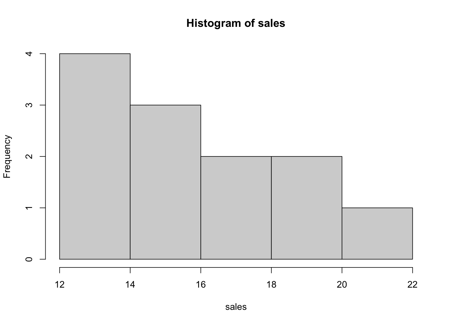
Figure 1: Example of histogram for descriptive statistics in R
The histogram gives us a visual representation of the distribution of the sales figures for the year. It shows us that most of the sales figures fall between 13 and 18, and there are fewer sales figures at the higher and lower end of the range.
Step 9: Add a Scatter Plot
To create a scatter plot in R, you can use the plot() function. The basic syntax is as follows:
`**plot(x, y, main = "Scatter Plot", xlab = "X Variable", ylab = "Y Variable", pch = 16)**`
Here, x and y are the variables that you want to plot. The main argument is the title of the plot, xlab and ylab are the labels for the x-axis and y-axis, respectively, and pch is the plotting symbol used.
Since we only have one variable in our sales data, we can plot it against our sequence of sales numbers to create a scatter plot:
x <- 1:12
plot(x, sales, main = "Scatter Plot of Sales", xlab = "Month", ylab = "Sales", pch = 16)
This will create a scatter plot of the sales data, with the months on the x-axis and the sales figures on the y-axis. The pch argument sets the plotting symbol to a solid circle ("16").
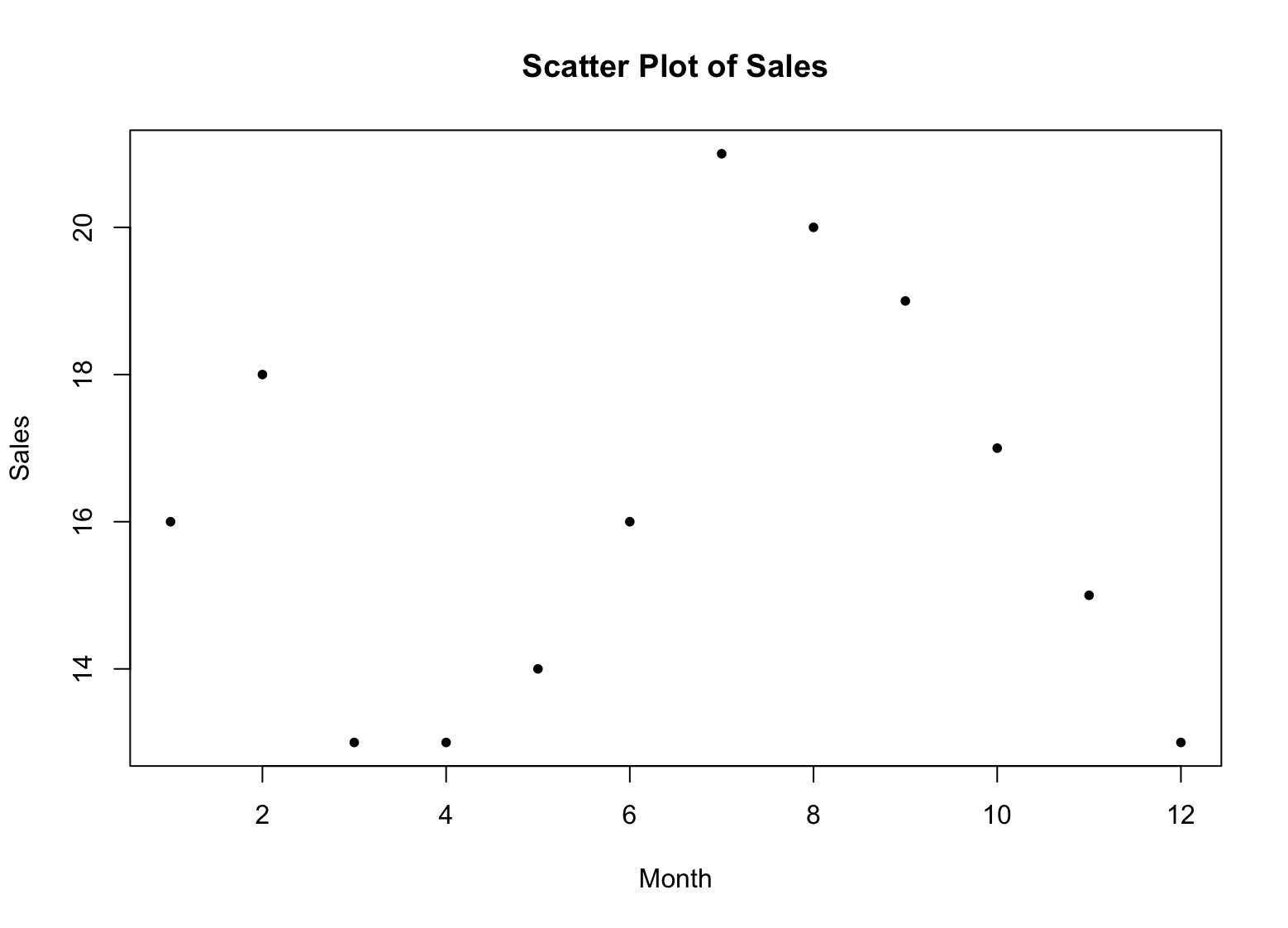
Figure 2: Example of scatter plot in R
Hmm.. we got a bunch of points but I think it is easier to visualize if we got a line connecting these points. Here is the syntax to connect the dots with a blue line:
`**lines(x, sales, type = "l", col = "blue")**`
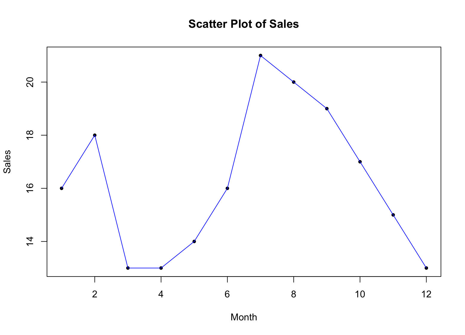
Figure 3: Example of scatter plot with lines in R
Alright, now what? How do we make sense of this graph in the context of our sales data?
-
Each point on the scatter plot represents a single data point, with the x-axis representing the months and the y-axis representing the sales figures.
-
By looking at the distribution of points on the scatter plot, you can get a sense of how the sales figures are distributed across the months. If the points are tightly clustered together, it suggests that the sales figures are similar across the months. If the points are more spread out, it suggests that the sales figures are more variable across the months.
-
By looking for patterns in the distribution of points, you can identify any trends or patterns in the data. For example, if the points form a straight line, it suggests that there is a linear relationship between the months and the sales figures. If the points form a curved line, it suggests that there is a non-linear relationship between the months and the sales figures.
-
Outliers are represented as individual points that are significantly different from the rest of the data. By identifying outliers, you can see if there are any months with significantly higher or lower sales figures, which may warrant further investigation.
Let's make our scatter plot more meaningful and add a trend line using the abline() function:
fit <- lm(sales ~ x)
abline(fit, col = "red")
This will add a regression line to the plot, showing the overall trend in the sales data. The col argument sets the color of the line to red. Of course, you can choose any other color that meets your fancy.
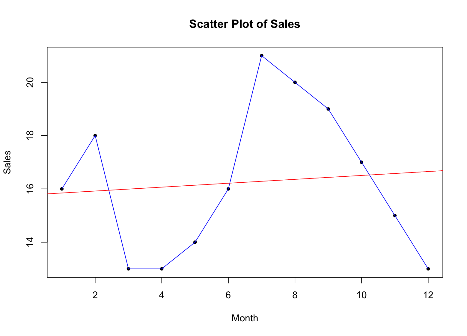
Figure 4: Example of scatter plot with trend line for descriptive statistics in R
Step 10: Create a Box and Whisker Plot
In R, you can create a box and whisker plot, also known as a boxplot, using the boxplot() function. The basic syntax is as follows:
`**boxplot(x, main = "Box and Whisker Plot", xlab = "Group", ylab = "Value", col = "blue")**`
Here, x is the variable that you want to plot, main is the title of the plot, xlab and ylab are the labels for the x-axis and y-axis, respectively, and col is the color of the boxplot.
For example, to create a box and whisker plot of the sales data, you can use the following code:
`**boxplot(sales, main = "Box and Whisker Plot of Sales", xlab = "Month", ylab = "Sales", col = "blue")**`
This will create a box and whisker plot of the sales data, with the months on the x-axis and the sales figures on the y-axis. The col argument sets the color of the boxplot to blue.
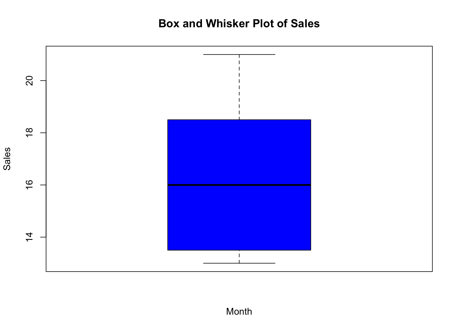
Figure 5: Example of box plot for descriptive statistics in R
So, how do we interpret the box and whisker plot for our sales data? Here you go:
-
The box represents the interquartile range (IQR), which is the range between the first and third quartiles (25th and 75th percentiles) of the data. The height of the box represents the IQR.
-
The median is represented by a line within the box. It is the value that separates the upper and lower halves of the data.
-
The whiskers represent the minimum and maximum values of the data, excluding any outliers. Outliers are represented as individual points outside of the whiskers.
-
Outliers are represented as individual points outside of the whiskers. They represent values that are significantly different from the rest of the data.
By looking at the box and whisker plot of the sales data, you can quickly see the distribution of sales figures for the year. You can see where the median is located, as well as the range of values (IQR) and any potential outliers. This information can help you make informed decisions about your data and identify any areas that may require further investigation.
Frequently Asked Questions
Wrapping Up
And that's a wrap! We hope you enjoyed this journey into the world of descriptive statistics in R. We covered quite a bit of ground, from calculating important descriptive statistics such as the mean, median, mode, range, standard deviation, and variance, to plotting visual representations of your data using, box plot, scatter plot and trend line.
We hope you found this article helpful and that you now have a better understanding of how to perform descriptive statistics in R. Remember, descriptive statistics are just the first step in any data analysis process, so feel free to explore further and dive deeper into the world of data analysis. And here's a good suggestion: simple example of linear regression in R.
So go ahead, keep exploring your data, and never stop learning! And as always, happy data analyzing!